Problem
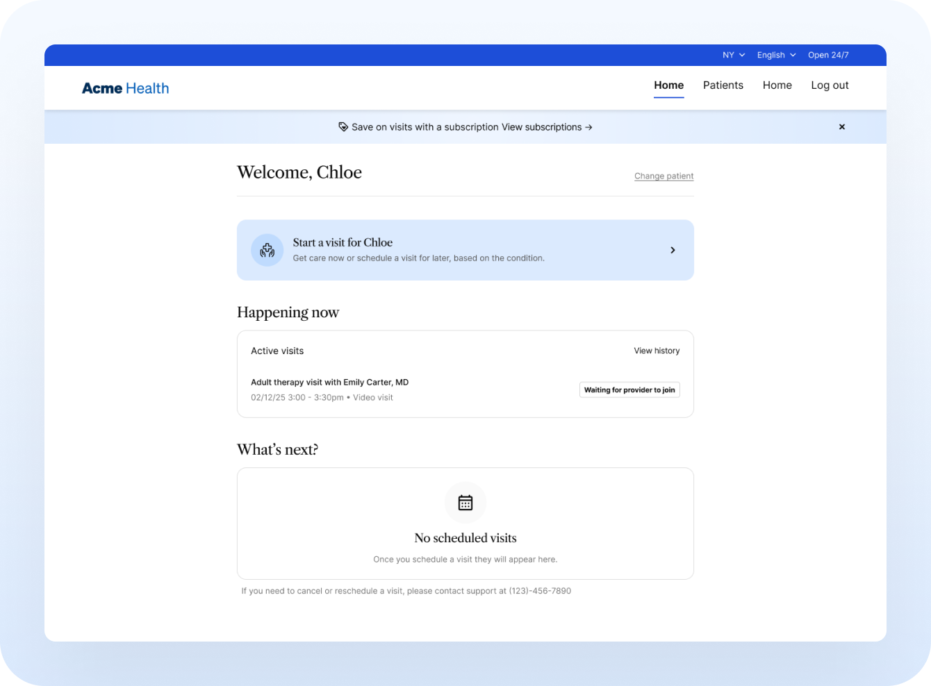
The existing MVP of subscriptions was exactly that - an MVP. It did not allow patients any choices between subscription packages, billing frequency, or member included. Without the ability to support differing subscription packages or configurations, and with a subscription required for patients to get care, patients were forced to sign up for something that might not have even fit their needs. To cap it all off, subscription management occurred in an external Stripe-hosted page, making it feel disparate from the rest of the experience.
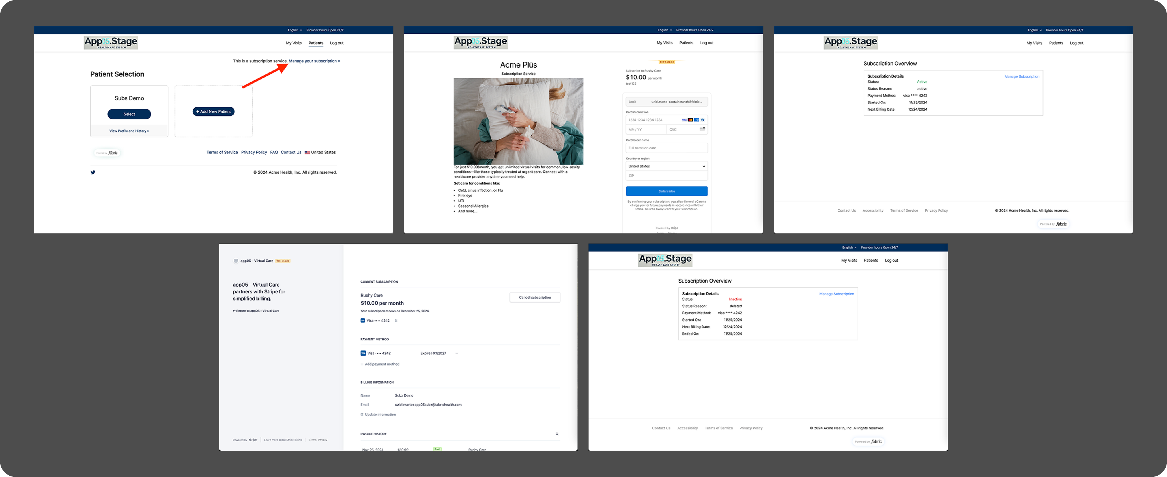
Existing MVP of subscriptions

Process
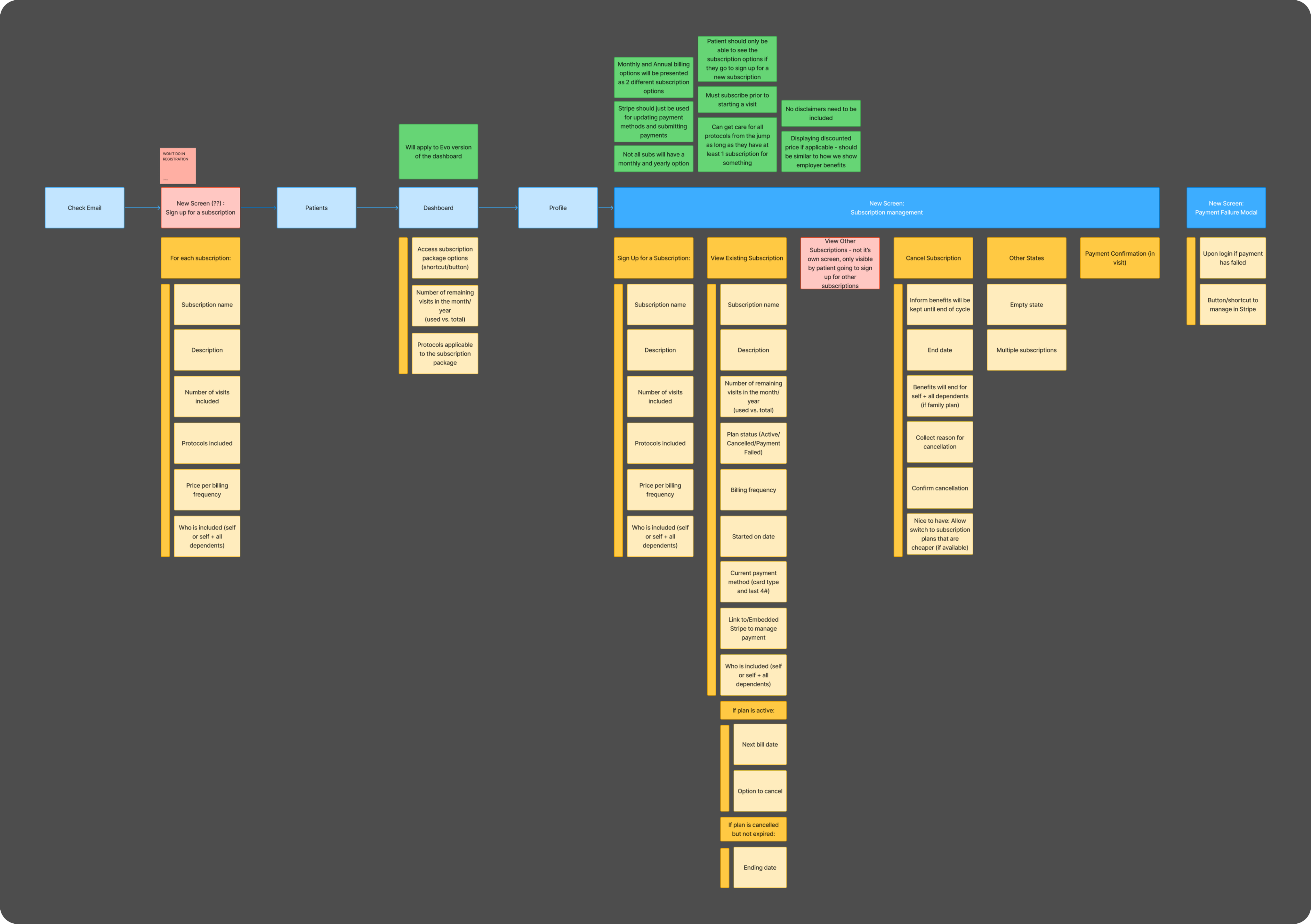
With some unclear expectations of the subscriptions offering, I started by breaking down the requirements and sorting them into different pages, helping to gain an understanding of what should appear at each point in the experience, what could be added to existing pages, and what would require net-new screens.
At the same time I took a look at competitors’ flows, digging into the sign up process, cancellation process, management of an existing subscription, and even what would happen in a user cancelled their subscription before the billing period was over.
Determining how subscriptions with fit in the flow
From there, I jumped into wireframes to begin making better sense of the requirements and identifying gaps. This was extremely beneficial in helping to discover what designs would be needed for flows outside of the happy path. The wireframes helped facilitate conversations with the product and engineering teams, and helped determine what additional information would be needed to continue.
Once we were at this stage, I met with the product and customer success teams to get a better idea of the fine details that needed to be included during sign up.
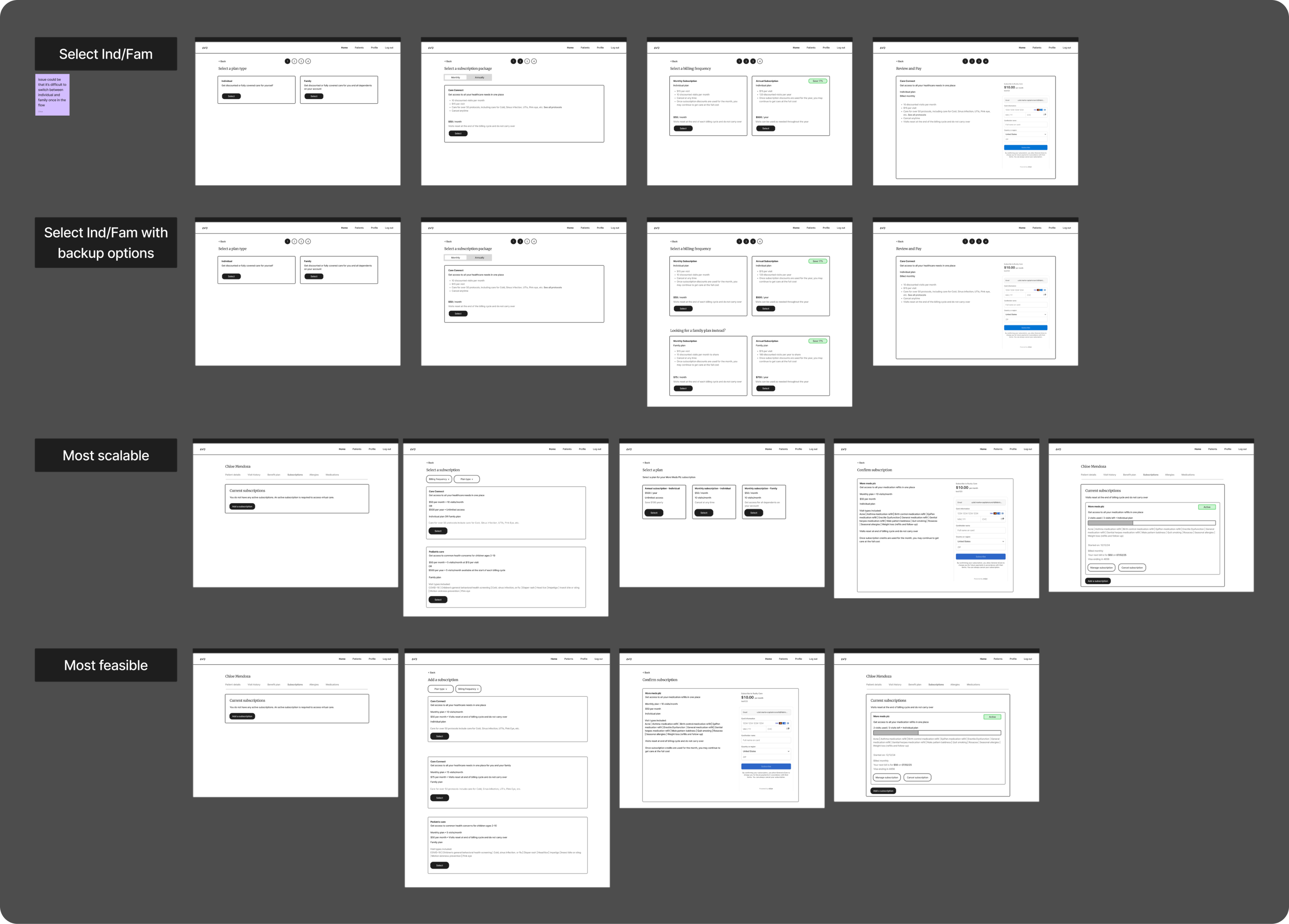
Selection of initial wireframes for sign up flow
When I had most of my questions answered, I jumped into high-fidelity mockups. At this stage, I felt that the dashboard was not as successful as I wanted, as it felt overloaded with information. I pushed back and proposed an alternative slimmer option to the product team, and after some refinements we ended with a design that we were all satisfied with. There were a few other areas that needed some minor tweaking to the previously existing experience, but overall we ended up with designs that would be successful for this next phase of subscriptions.
Solution
Building out the patient application in a few key areas took the subscriptions experience to the next level.
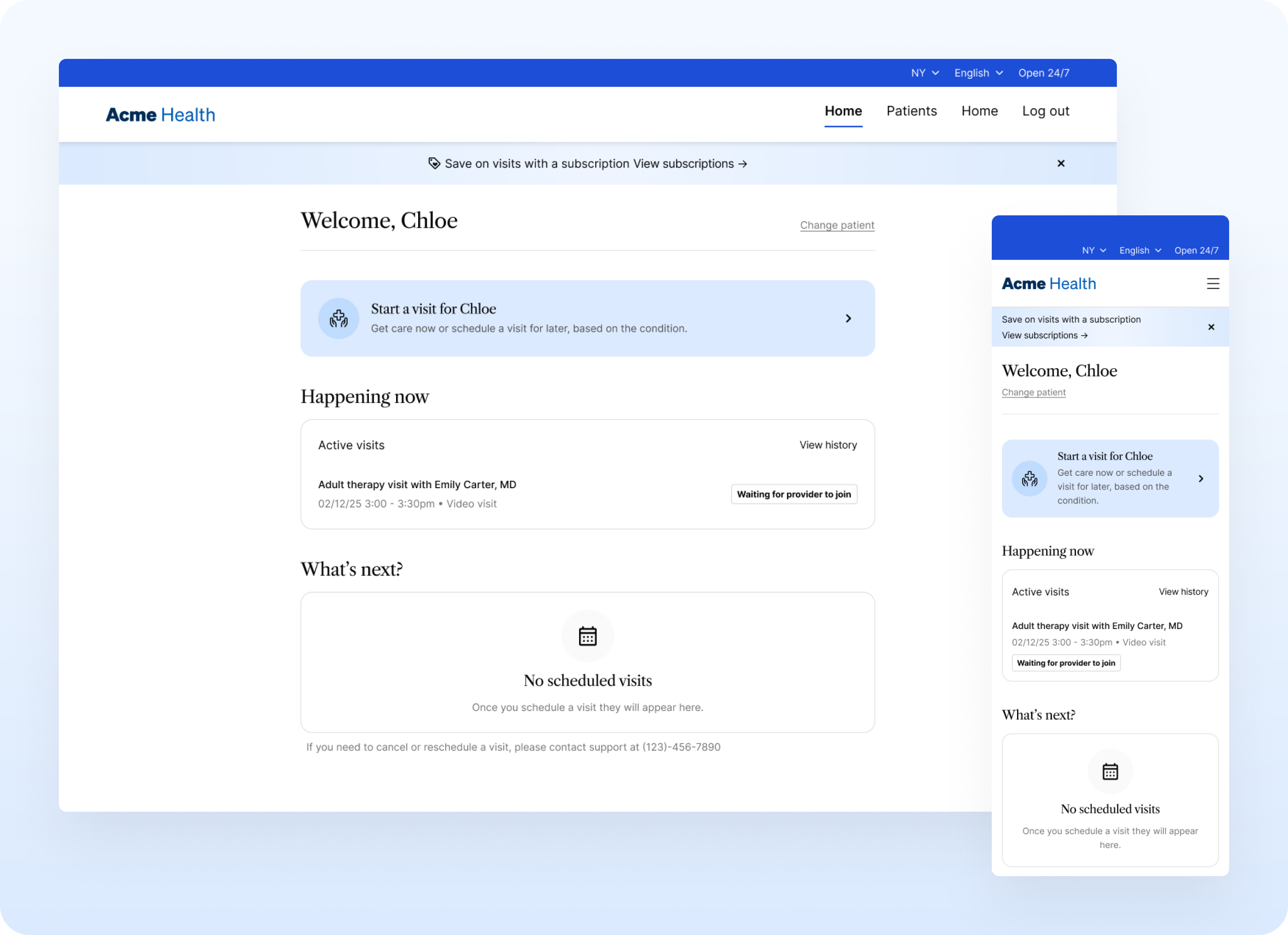
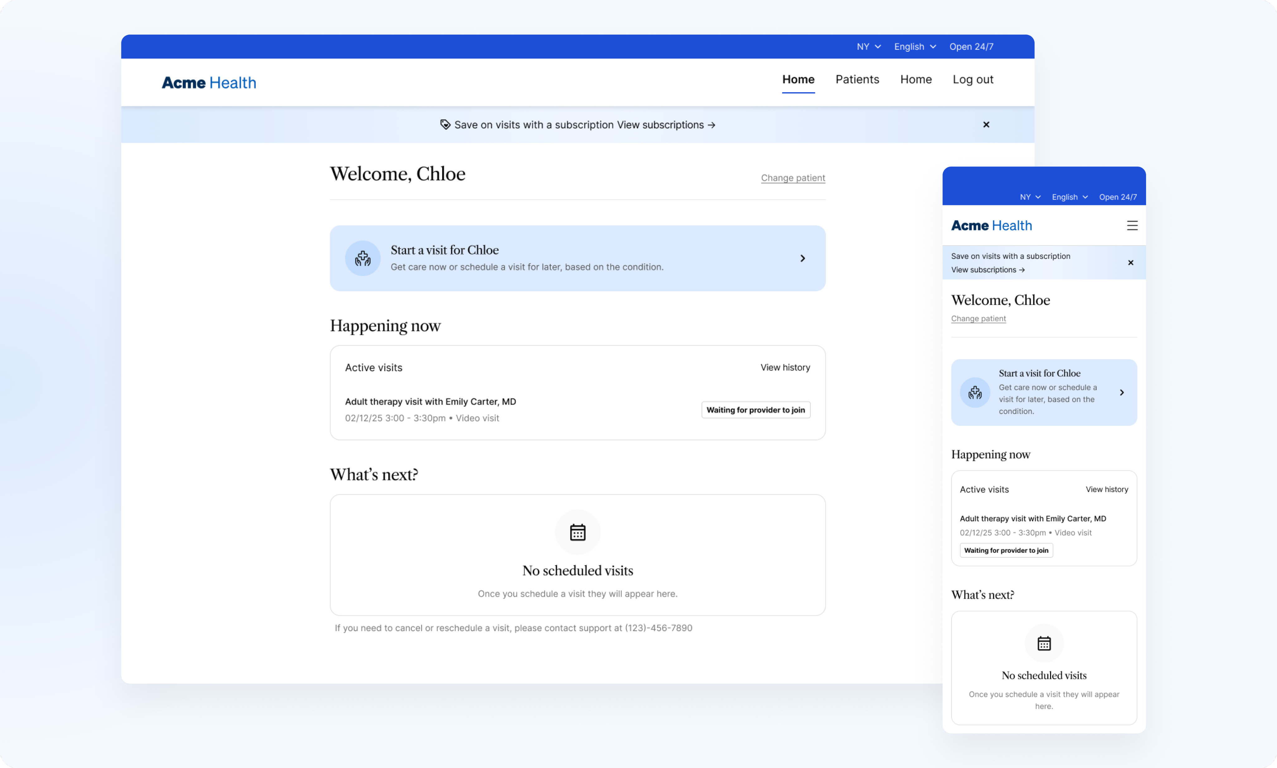
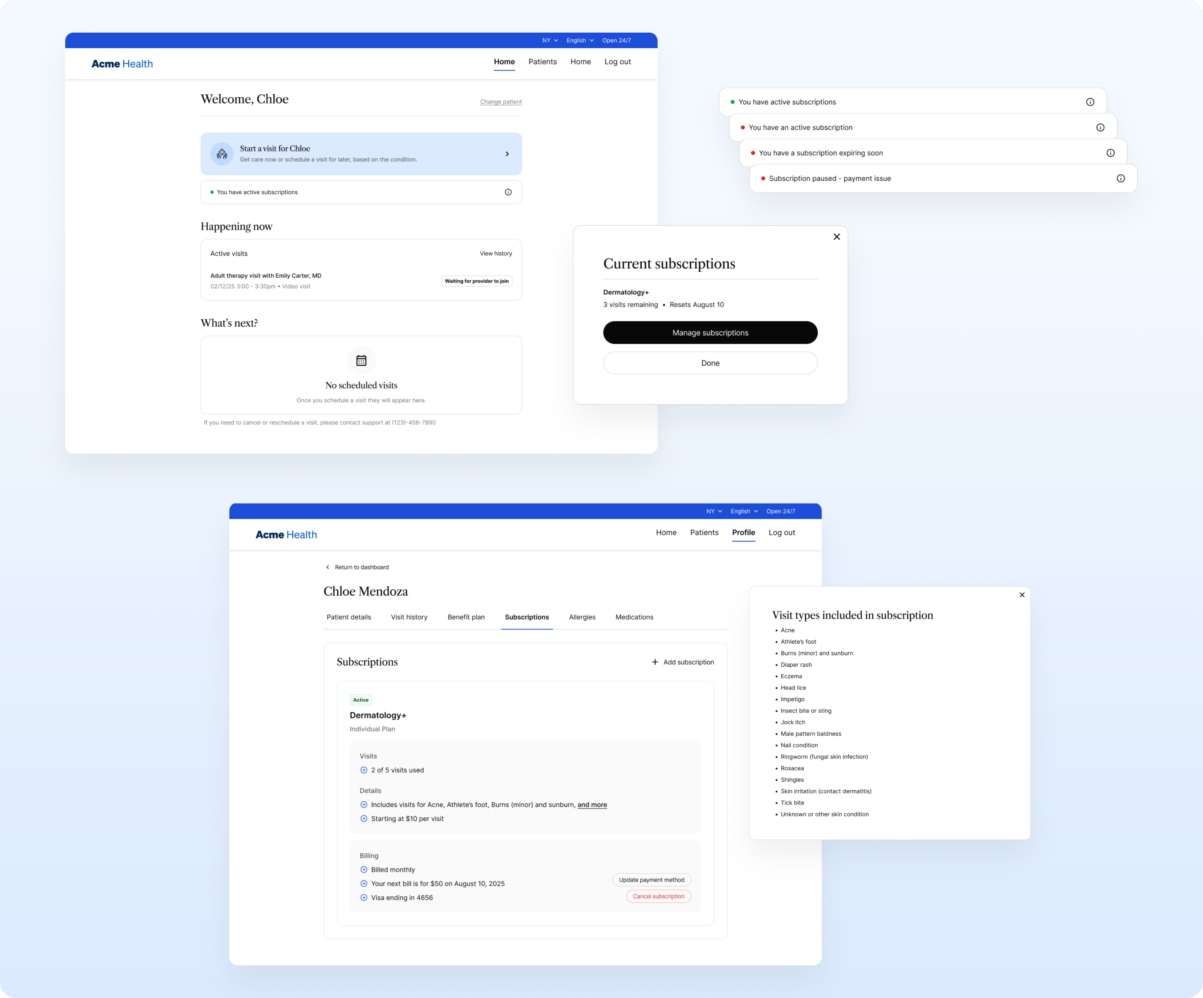
- Dashboard: Adding a clear indication of the current status helps users keep track of their subscription and quickly access relevant information
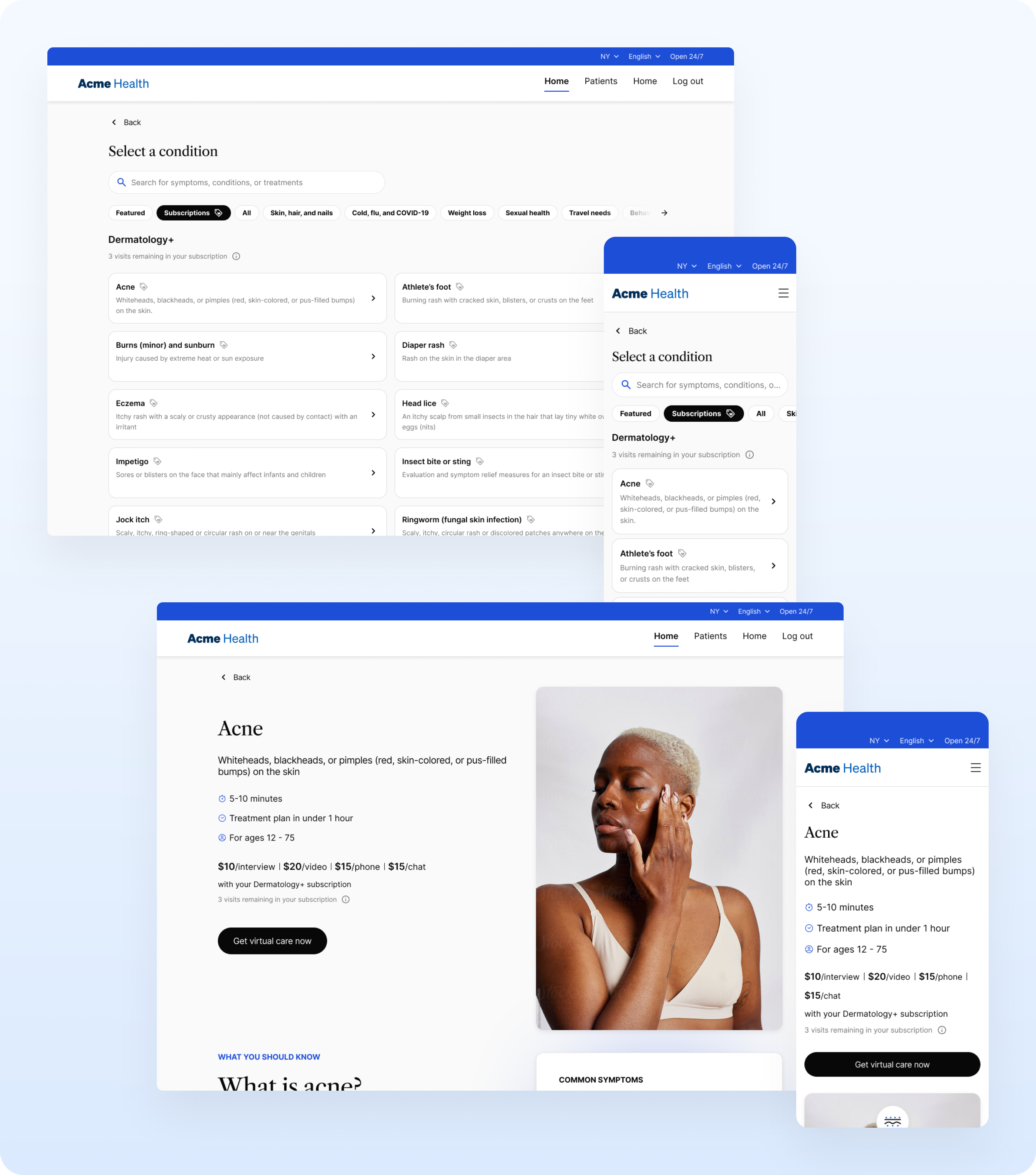
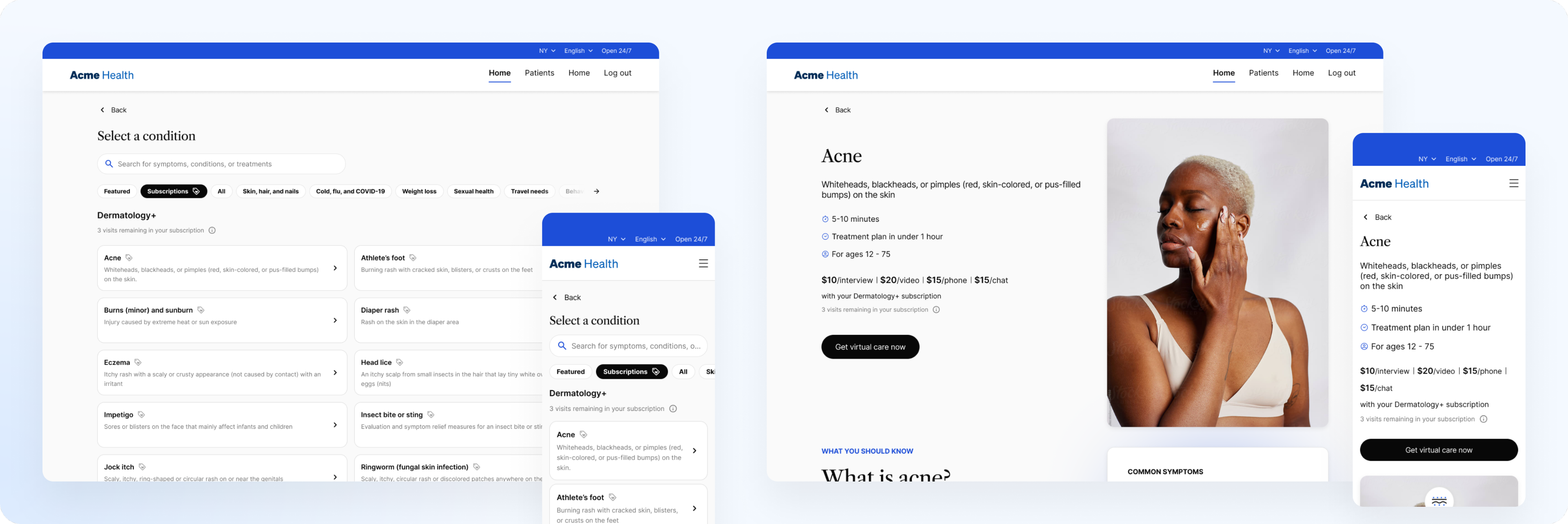
- Starting a visit: Designating eligible conditions and displaying remaining visits helps keep users informed of their remaining benefits
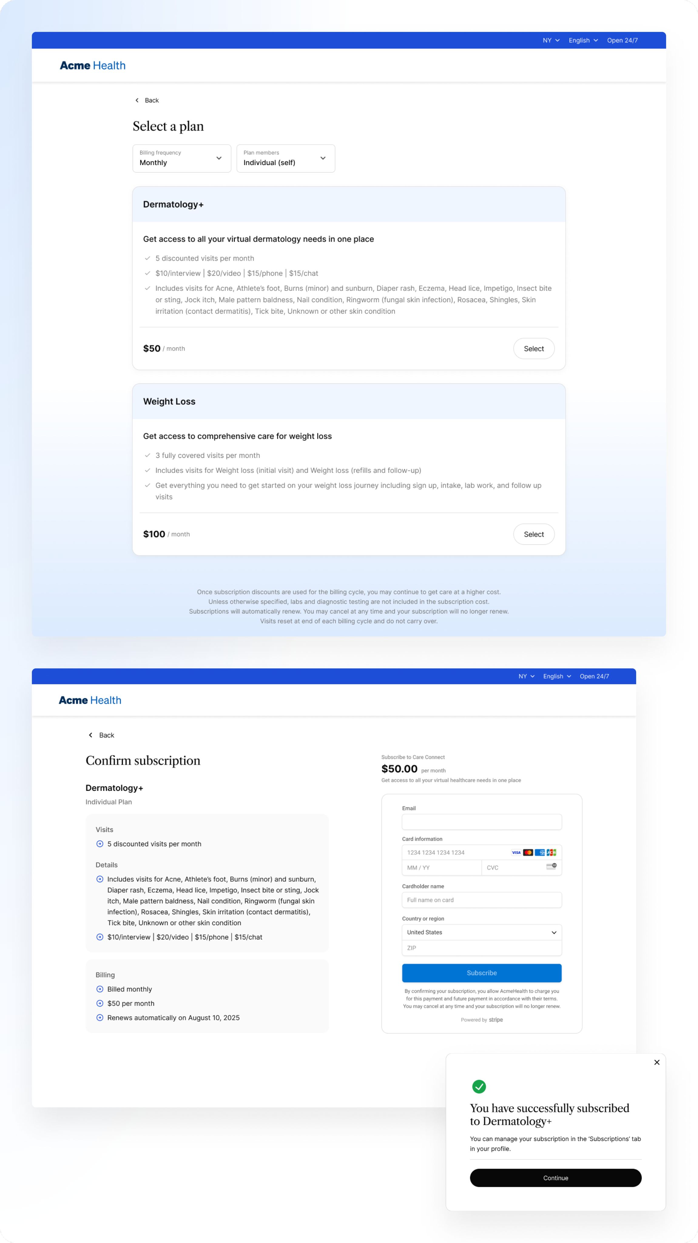
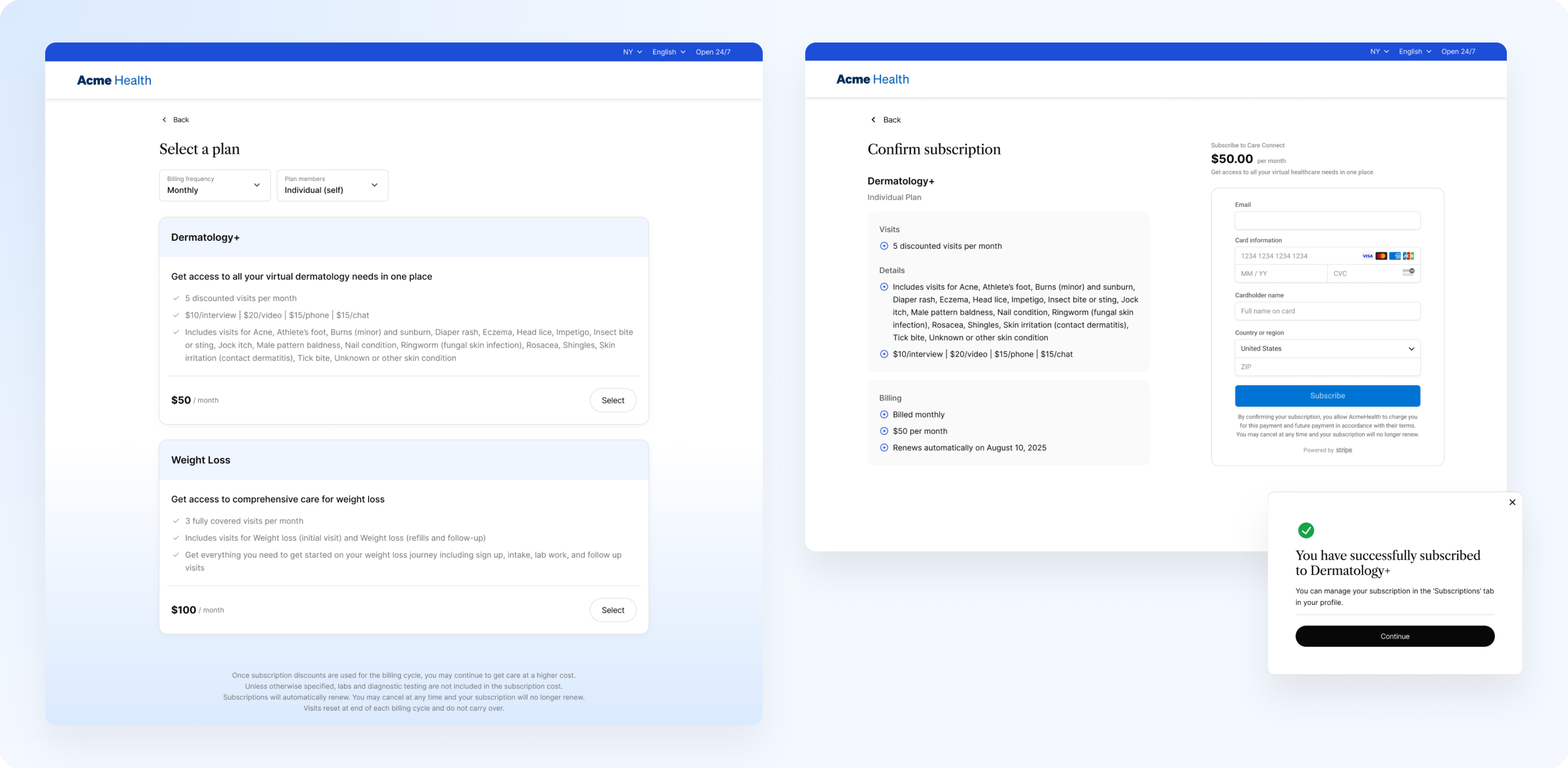
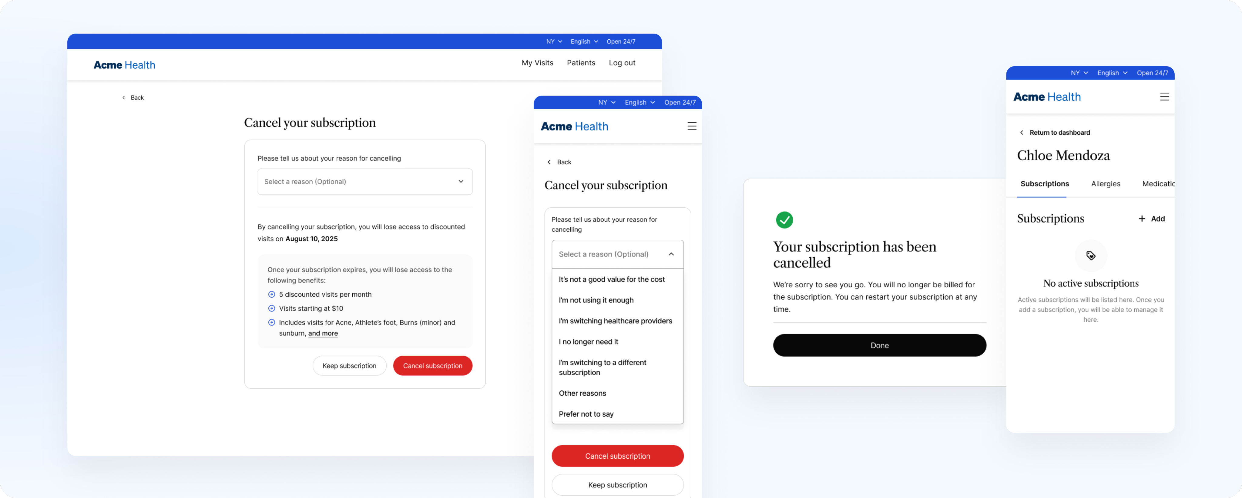
- Signing up: Enabling the patient to choose between different payment plans, different family members included, and different subscription packages introduced a necessary choice that was previously lacking
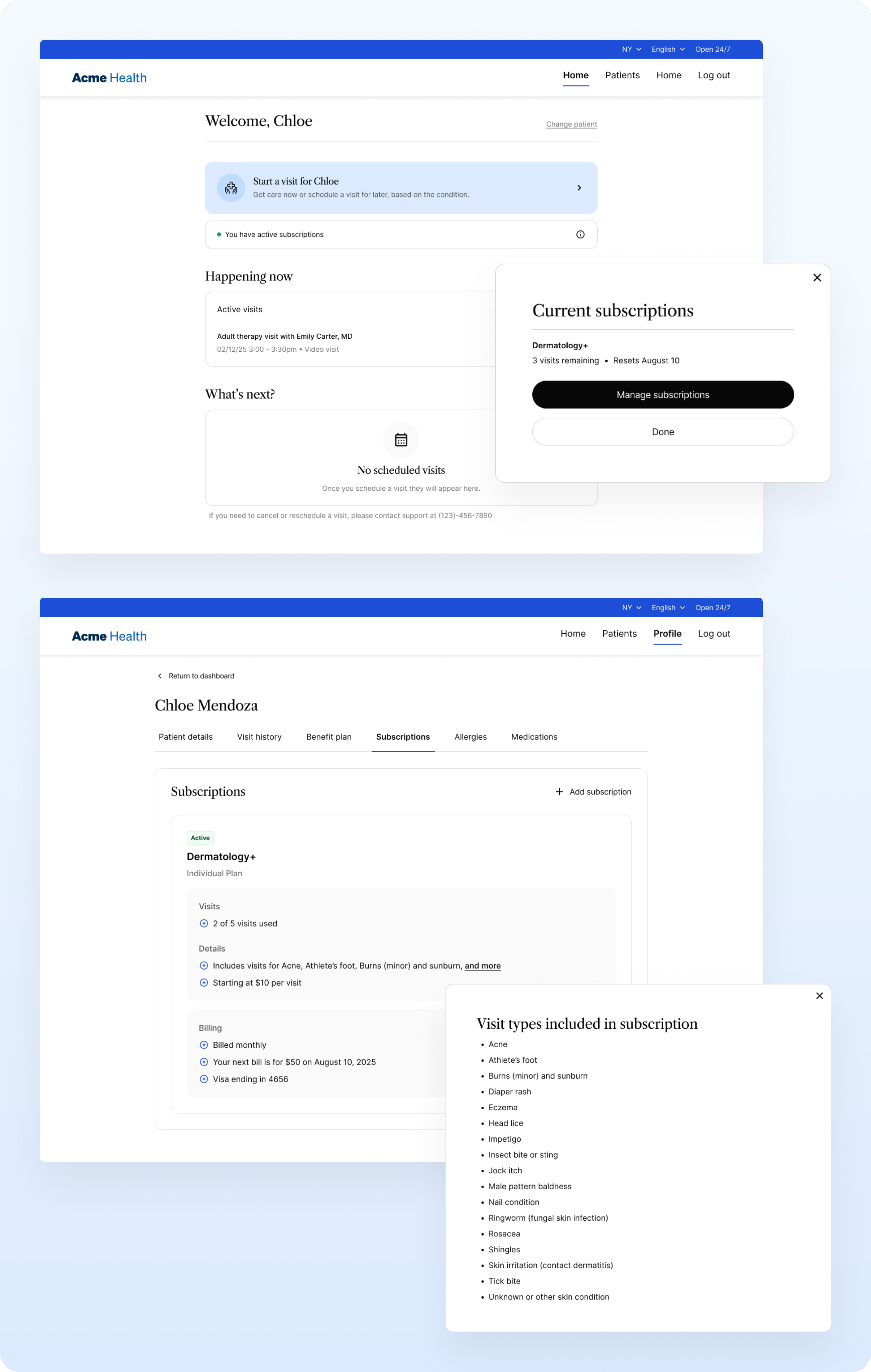
- Profile: Introducing subscription management to the patient profile helps our experience feel more on par with other services that offer subscription packages
Introducing patients to subscriptions with a banner in the revised experience
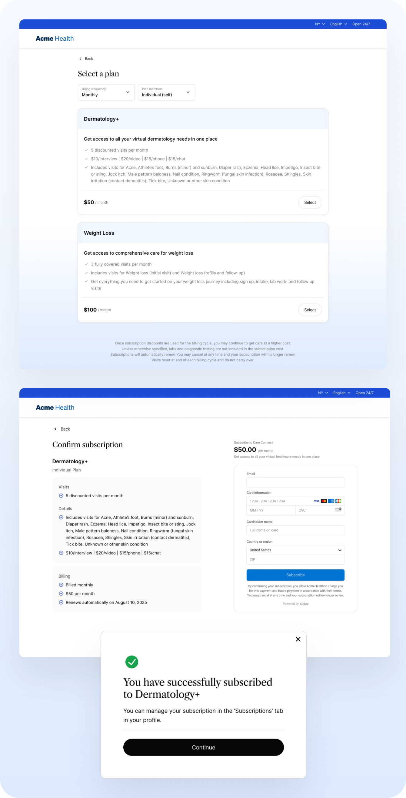
Signing up for a subscription
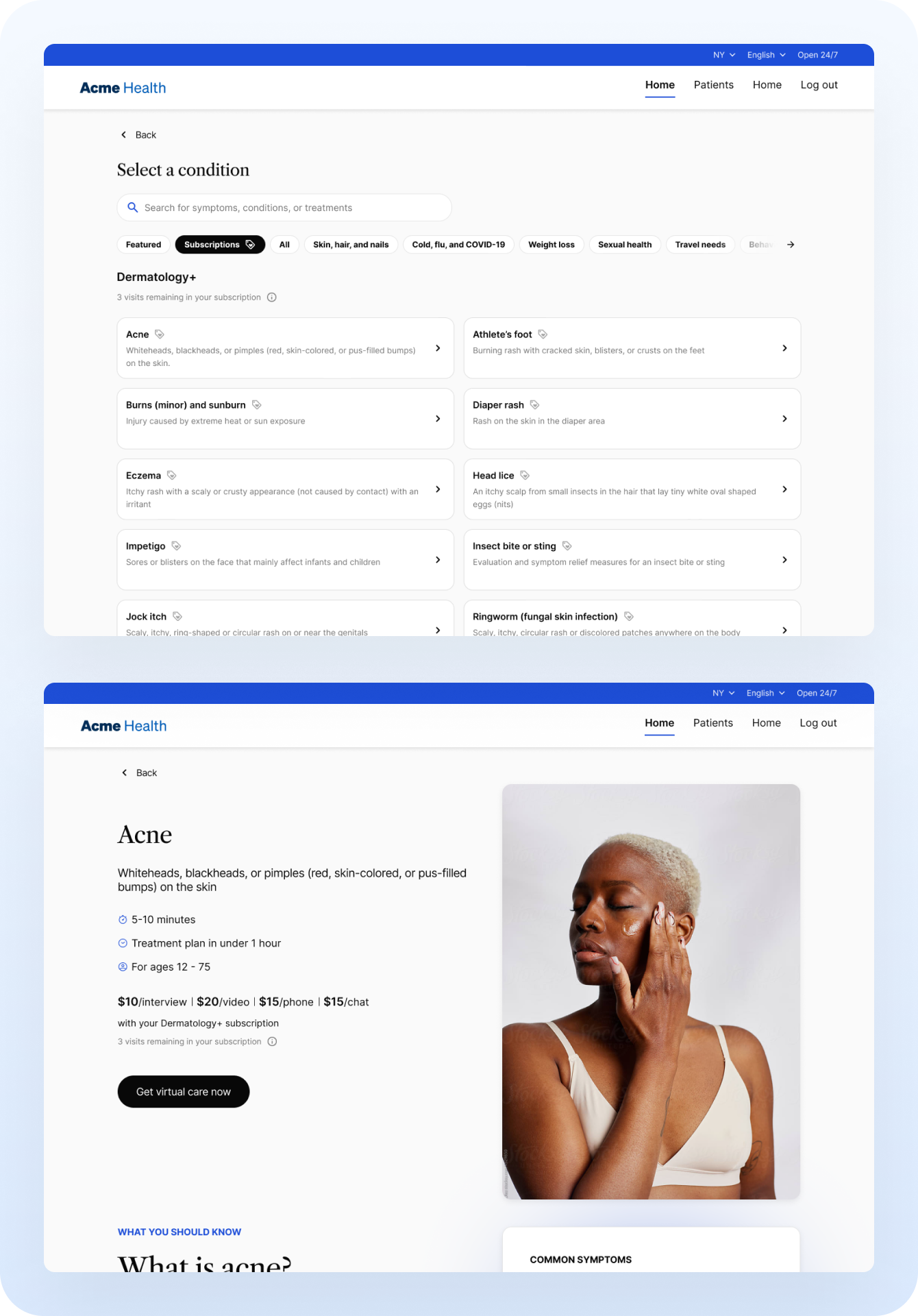
Selecting a condition to start a visit
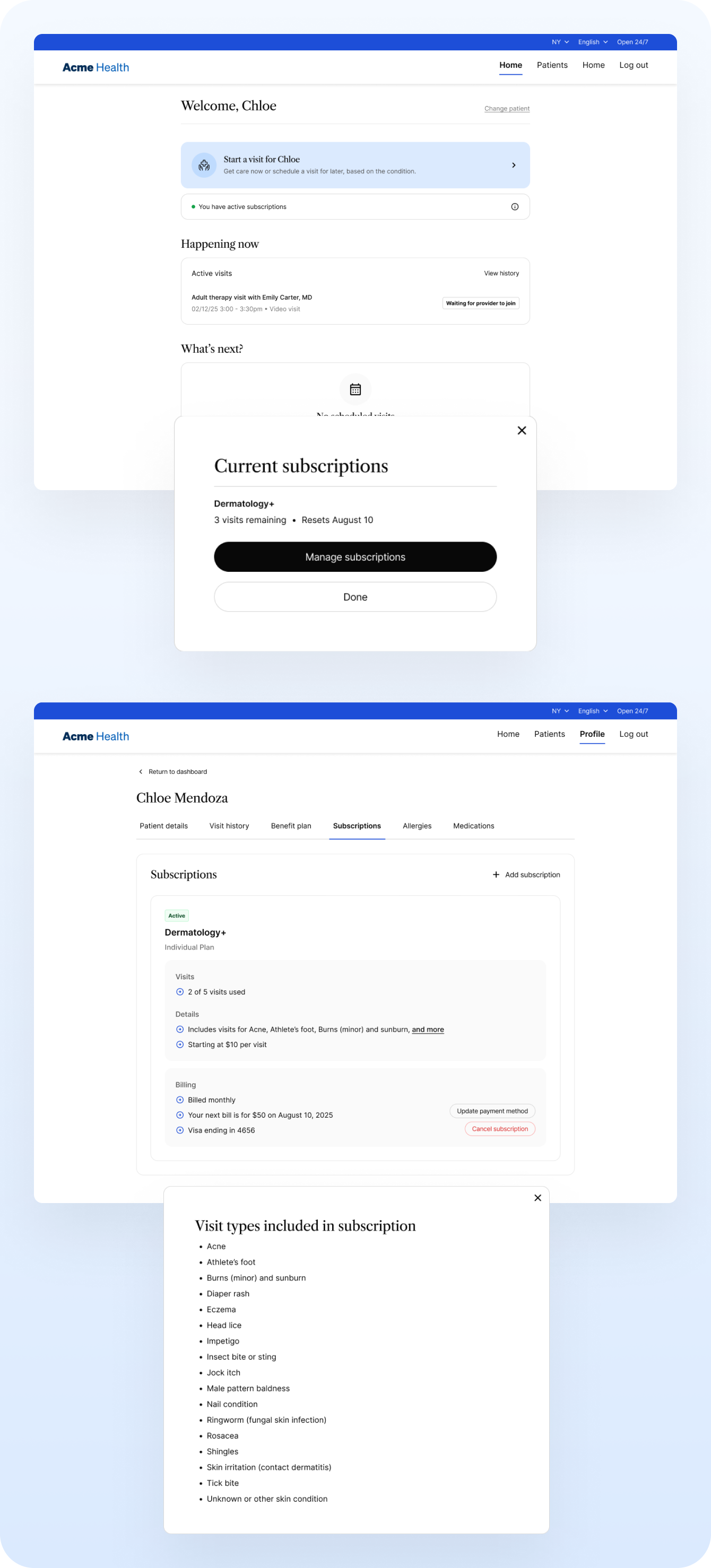
Viewing subscription details
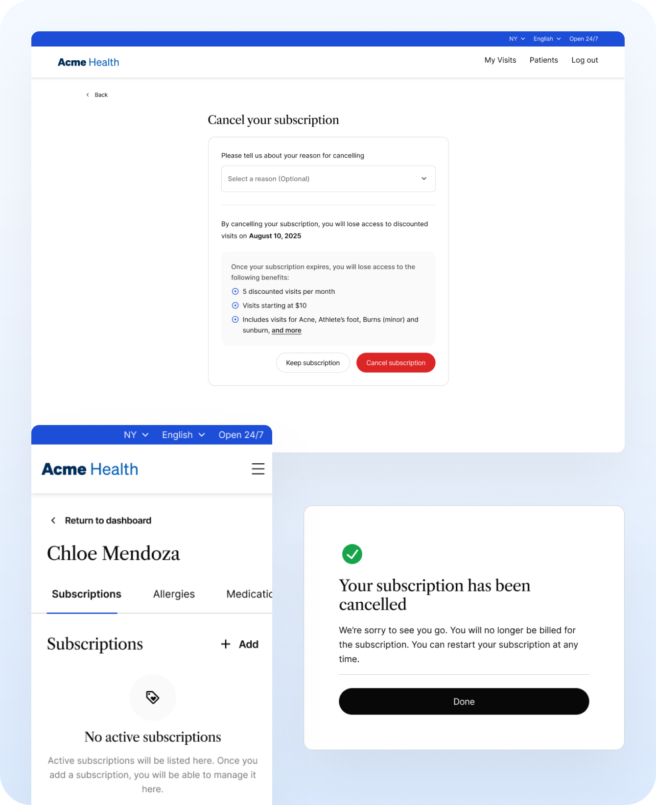
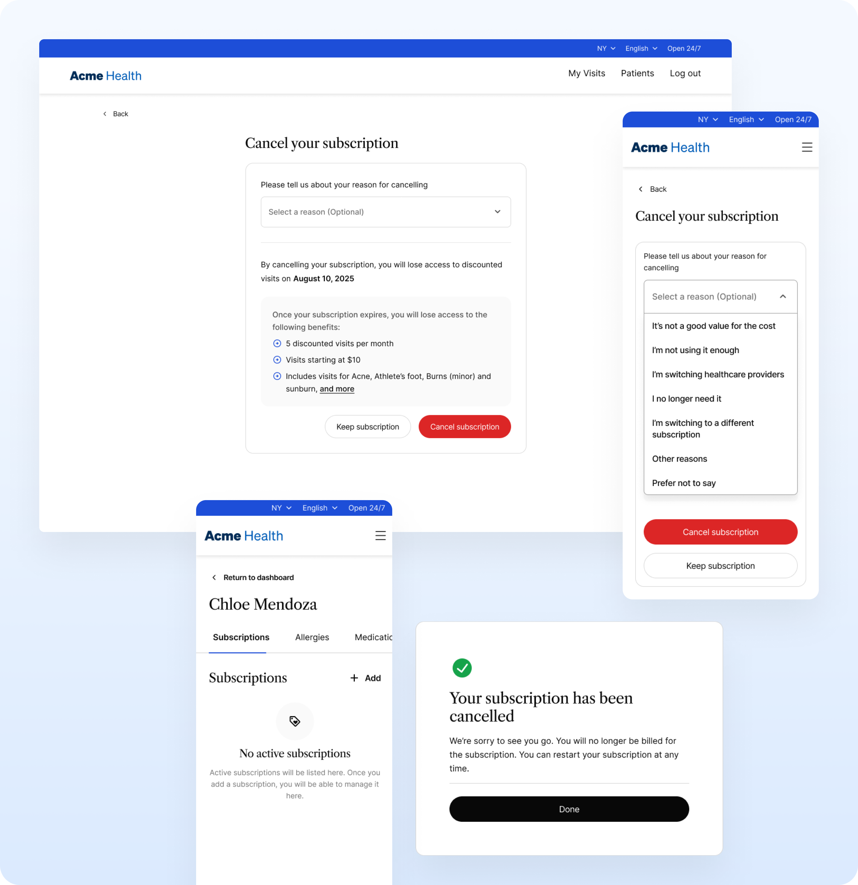
Cancelling an existing subscription