PROVIDER ENHANCEMENTS
Upgrading the application by adding new features and improving the existing experience

Dates
Apr 2023 - Aug 2025
Role
Design
Overview
In the two and a half years that I worked on the provider application, we completed many enhancements and new features. Some of these were self-initiated, some were driven by product, and a number came as product enhancement requests from customers. The scope of these projects ranged from smaller items, such as adding patient pronouns, to larger “mini epics”, such as developing and enforcing font styles across the application.

Sample of enhancements to existing features
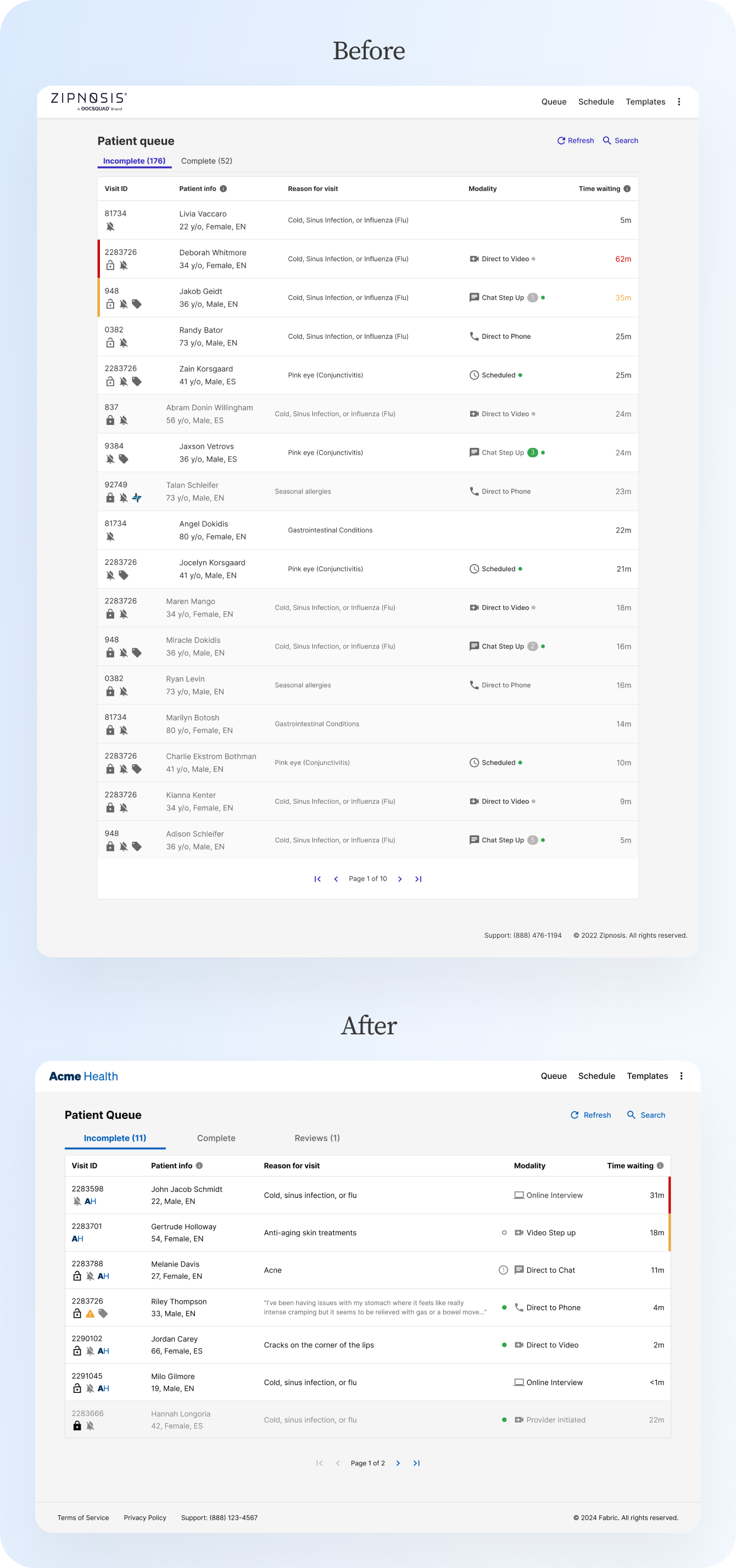
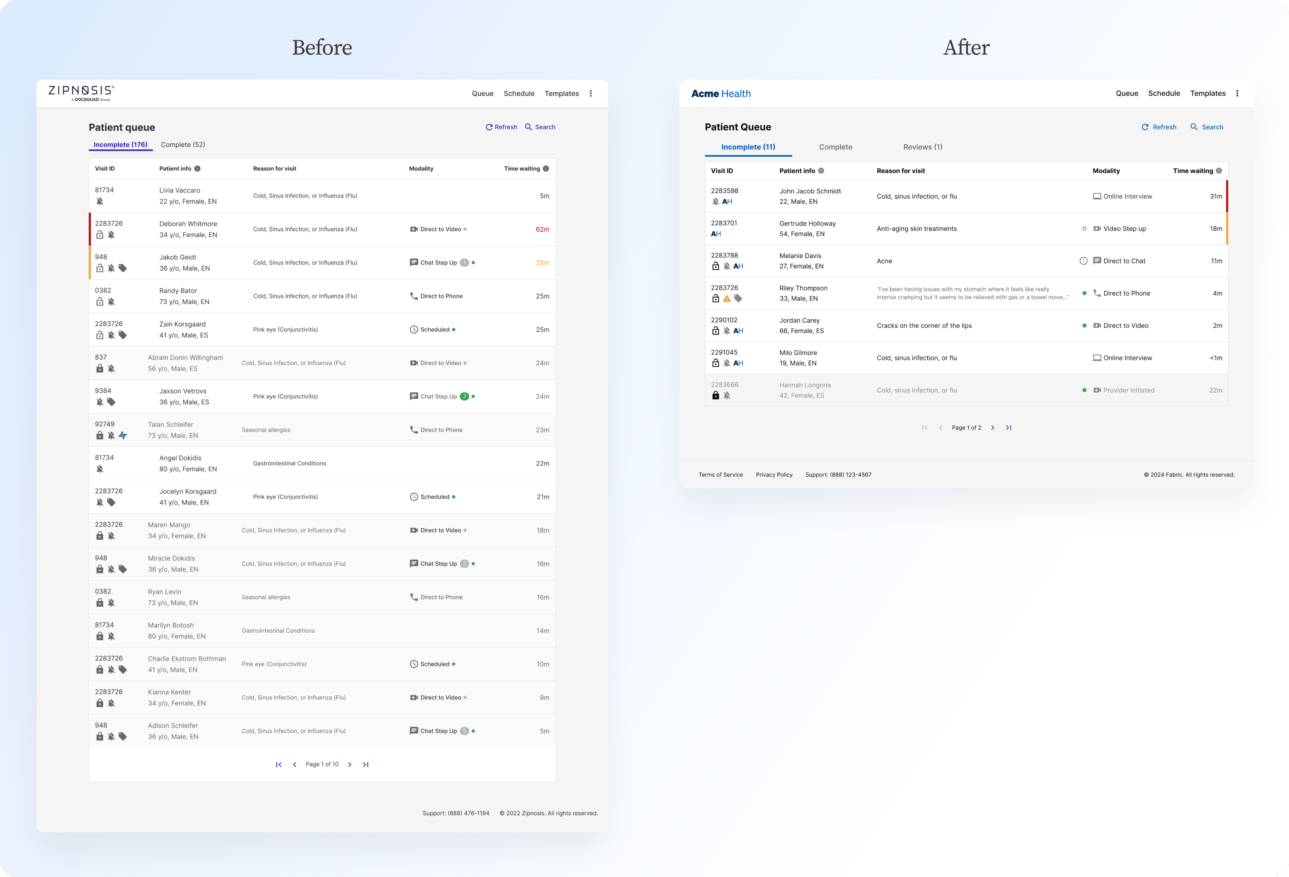
I updated the queue to improve accessibility and scannability, making the first step in the diagnosis process more efficient for providers. Moving the time indicator bar next to the time waiting made sense of the association, and allowed us to change the time waiting font color to black for all visits. I also cleaned up the online/offline statuses, message indicator, and visit type indicator in the modality column to help providers process this information real quickly. I worked with the engineering team to update the tabs to be more responsive and the page navigation feel more natural. Finally, for visits that are not for a specific condition, I revised the design to show providers a preview of the reason for visit so providers would not have to waste time clicking into the visit to get this information.
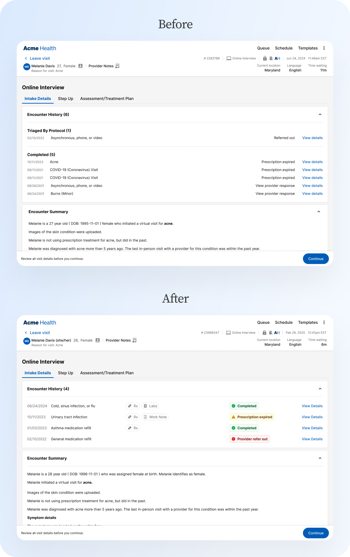
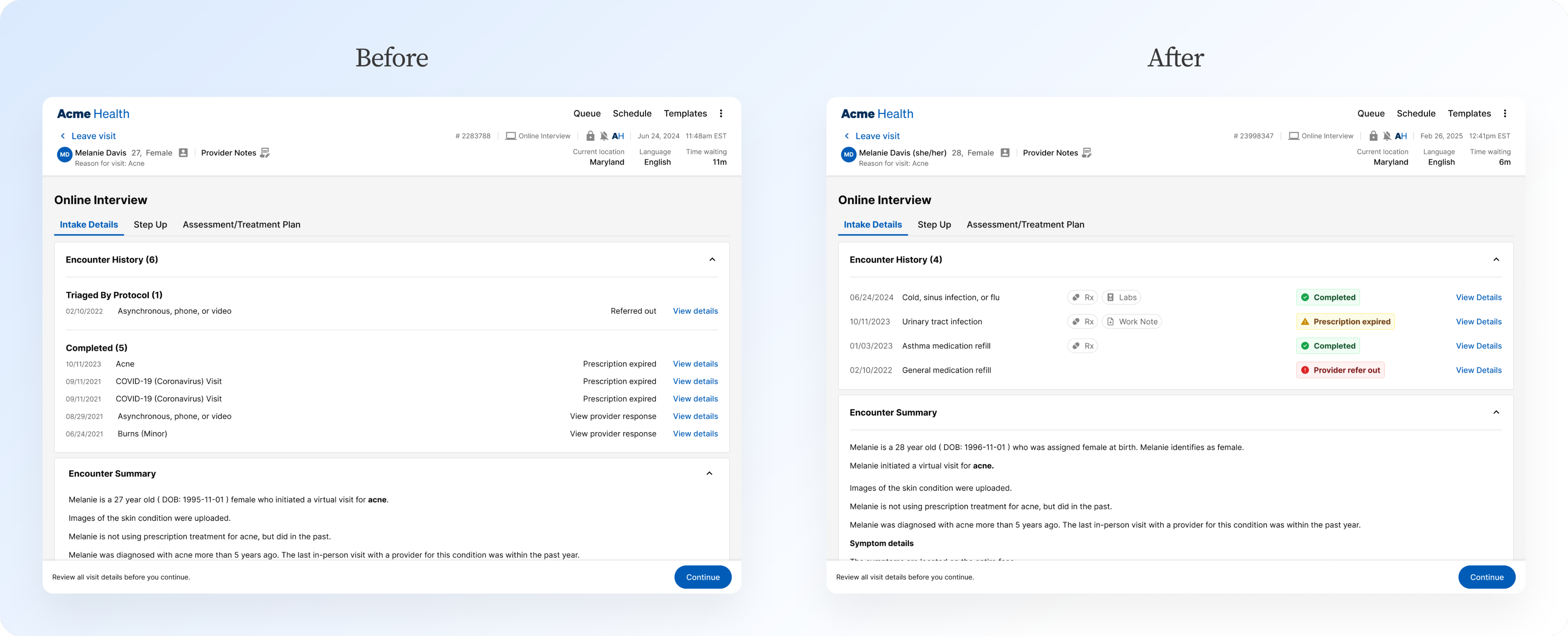
Updating the encounter history section helps providers to get a sense of when medications, labs, or school/work excuse notes are included at a glance. Further, improving the status chips makes the history easier to scan through, and moves to specify visits that were referred out by a provider rather than simply being marked as complete - an important distinction when considering medical history.
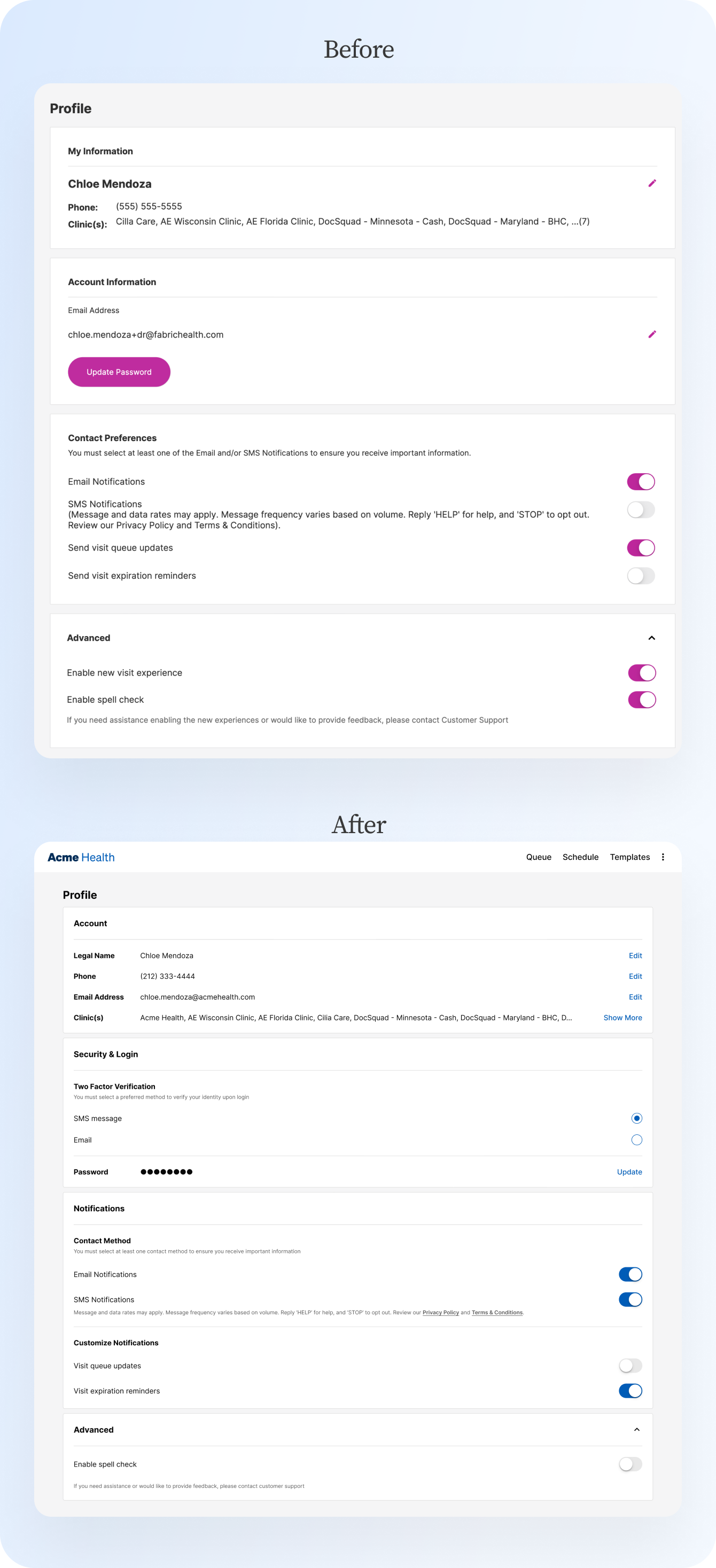
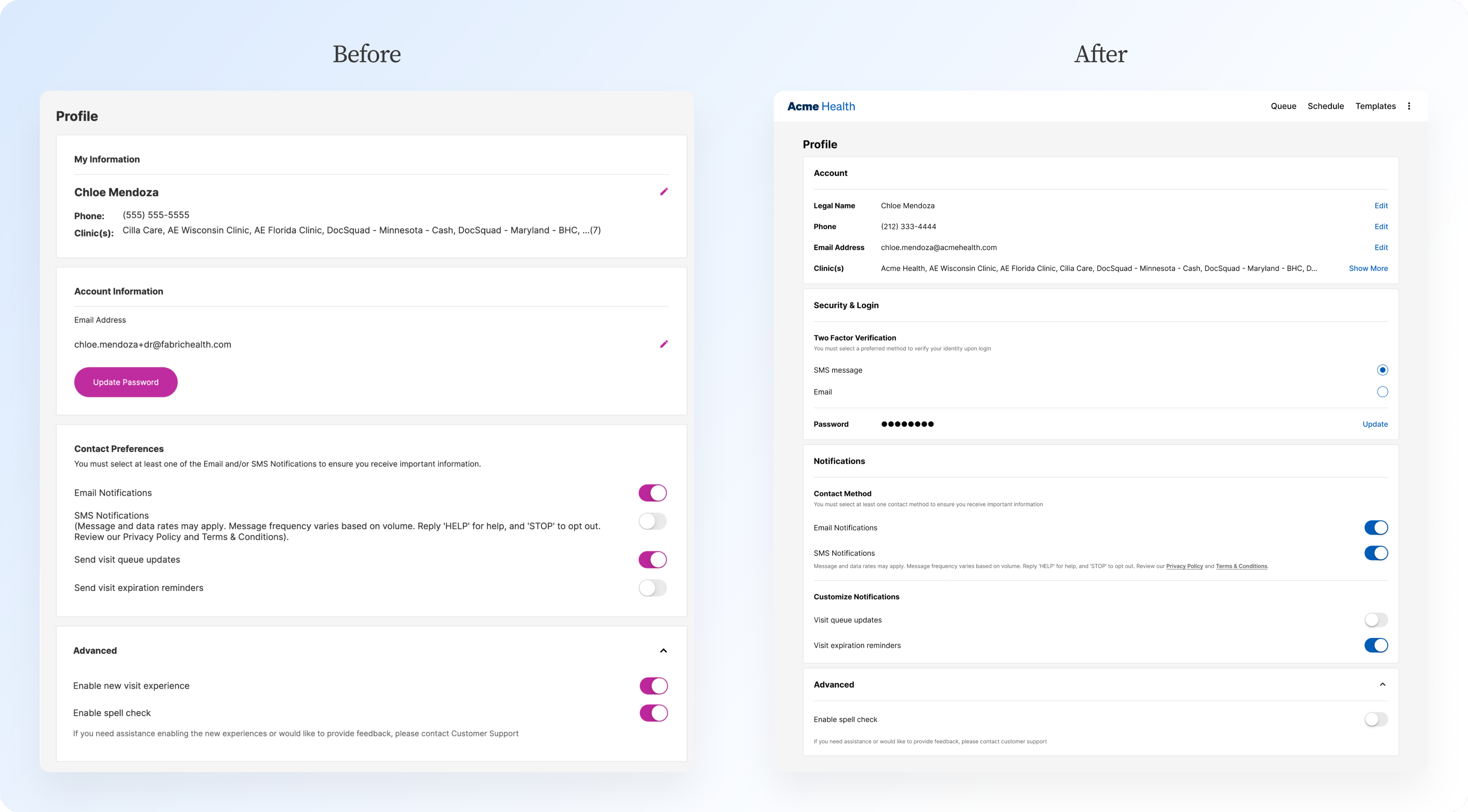
Inconsistent functionality in the profile screen was begging for an update. Unifying the behavior created a more consistent experience, and reorganization of the architecture created a better understanding of the groupings and allowed for the seamless addition of new features, such as two-factor authentication.
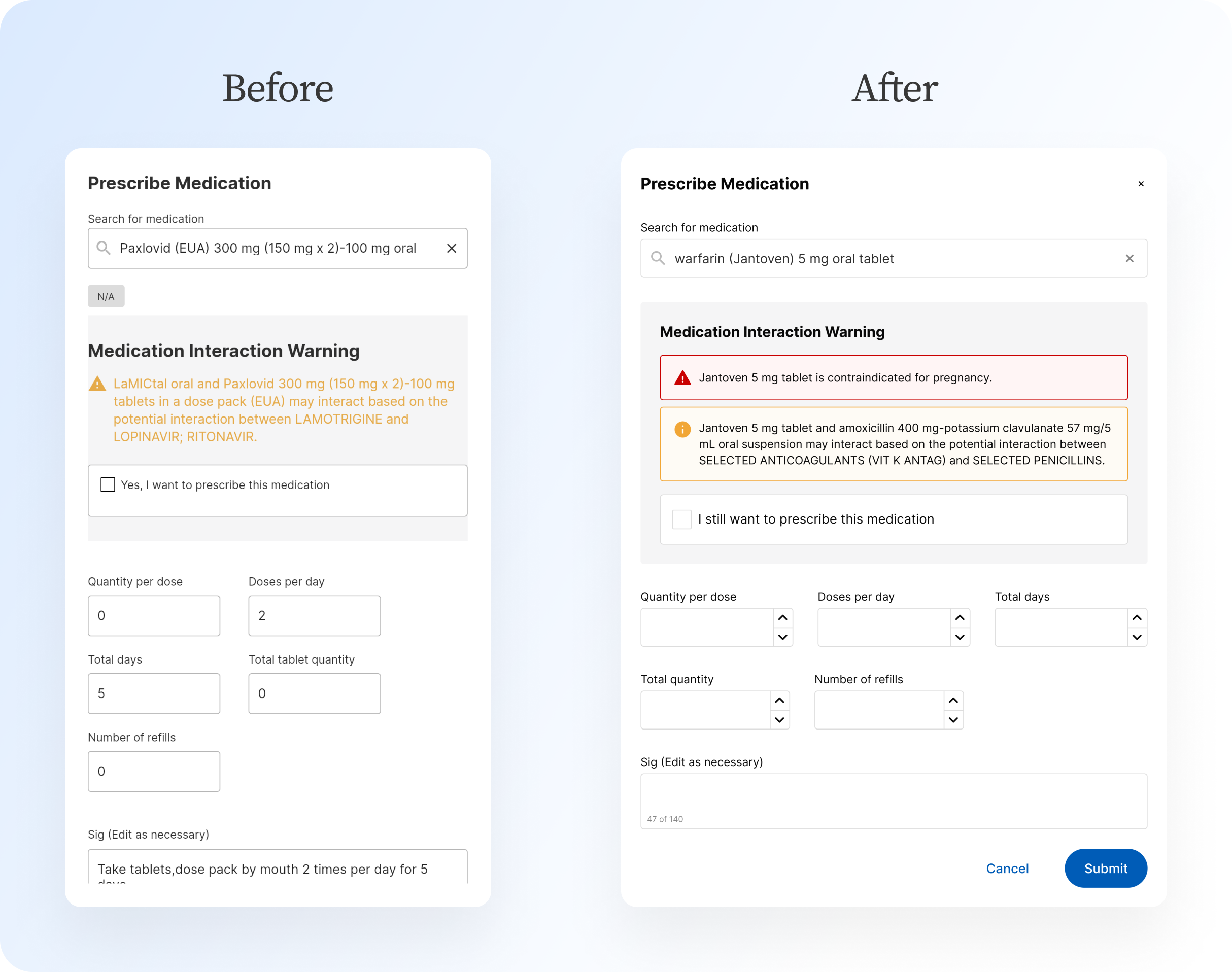
The medication interaction warning needed improvements in the UI and accessibility. I worked with engineering to fix up the alignment and padding, and worked to improve the warnings to meet accessibility standards. Introducing differing icons for the different severities of interactions and giving each warning a background color that would allow the text of the warning to remain black made a drastic difference.
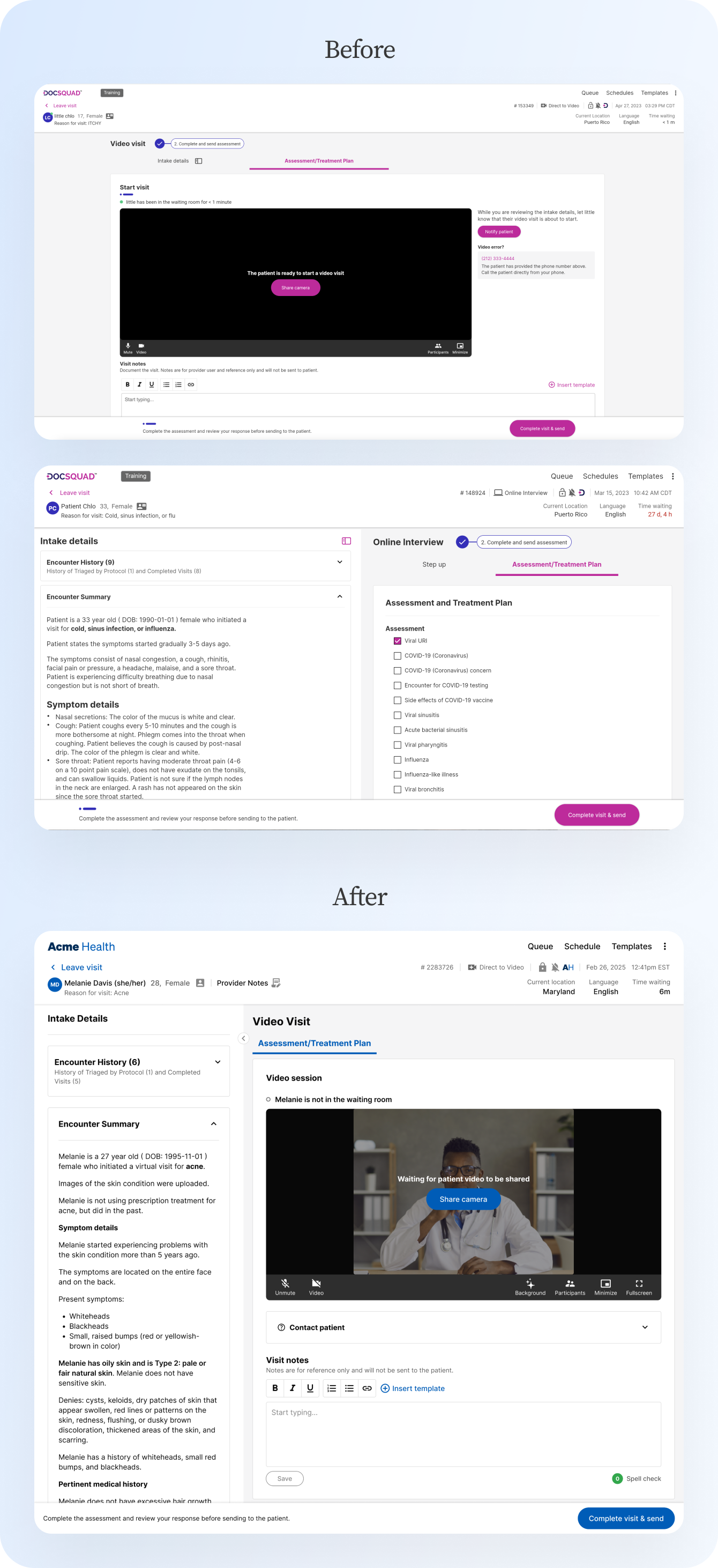
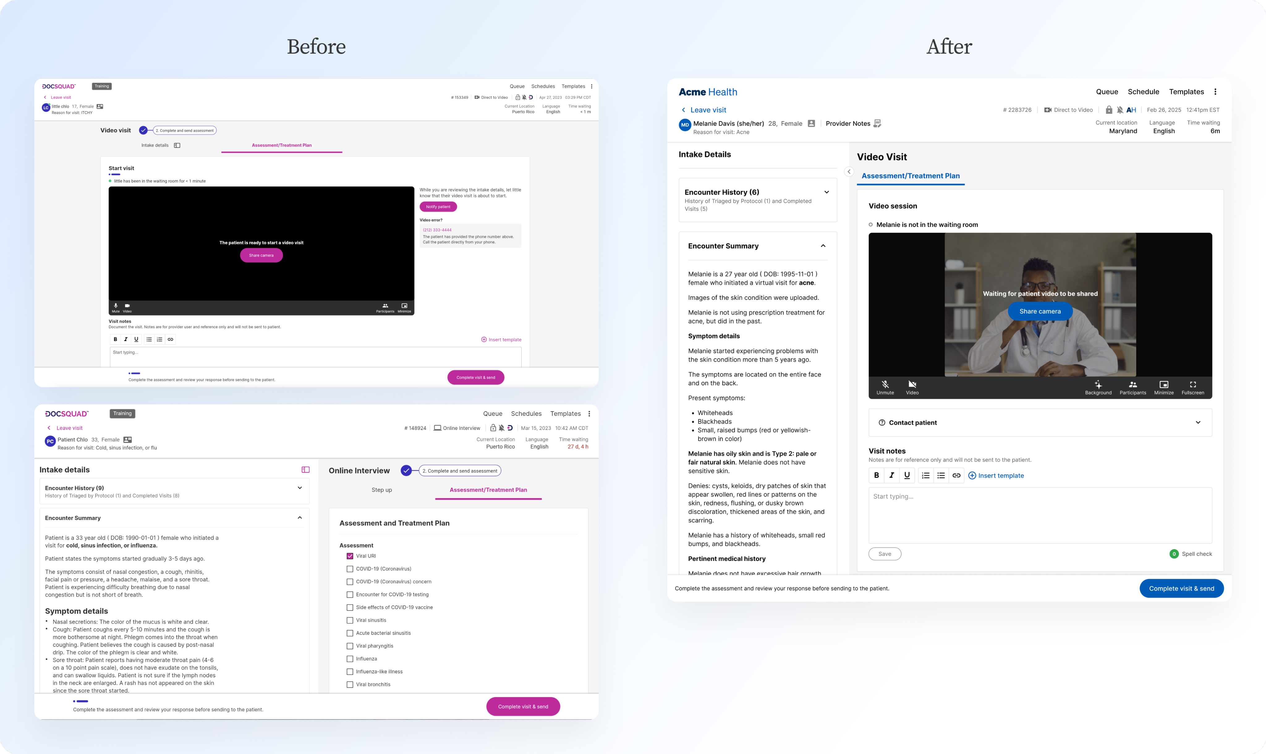
Updates to the diagnosis and video UI helped not only clean up the experience for providers, but also enabled them to have a bigger view of the video player. Bumping the information about contacting the patient into a dropdown beneath the video player helped with responsive behavior, and removed the focus from information that doesn’t get used all that often. Removing unnecessary step indicators next to the modality type reduced clutter, and updating the sidebar behavior of intake details provided a greater affordance.
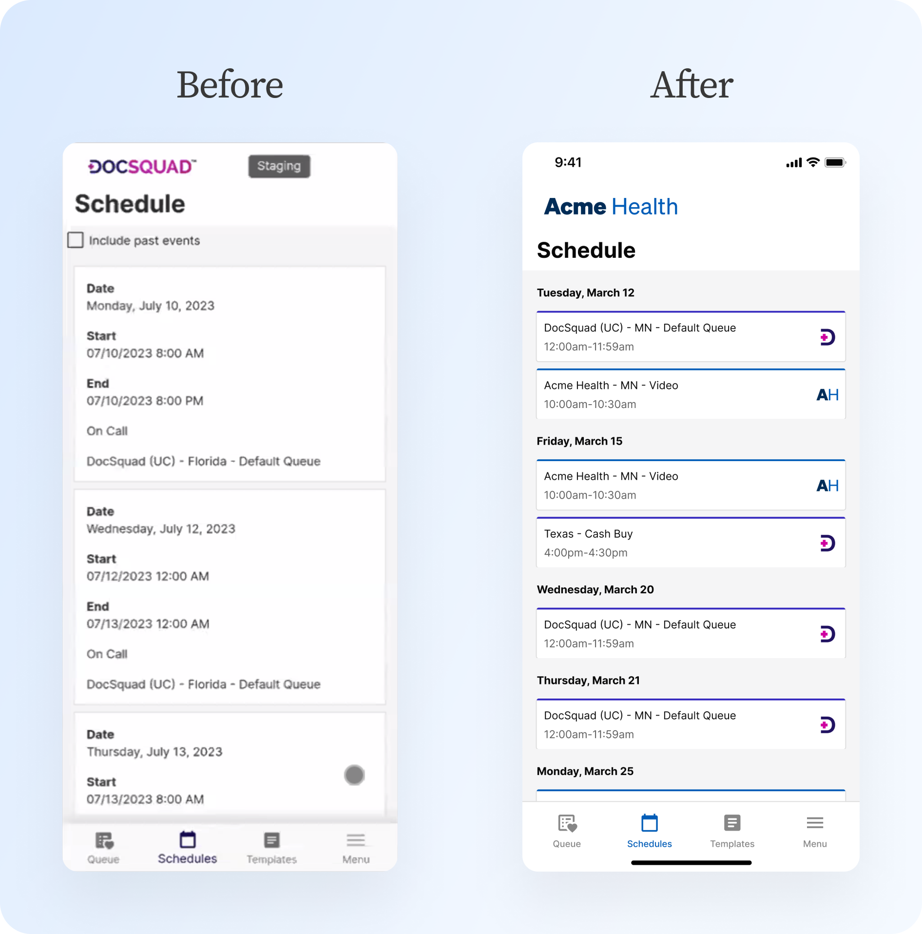
A quick clean up of the schedule page on mobile made a big change to the experience. I consolidated events to make the cards match the desktop experience, which also enabled me to group multiple events by day. Adding the ability to scroll up to view previous days also eliminated the need for the checkbox to include past events, creating a seamless scrollable calendar experience.
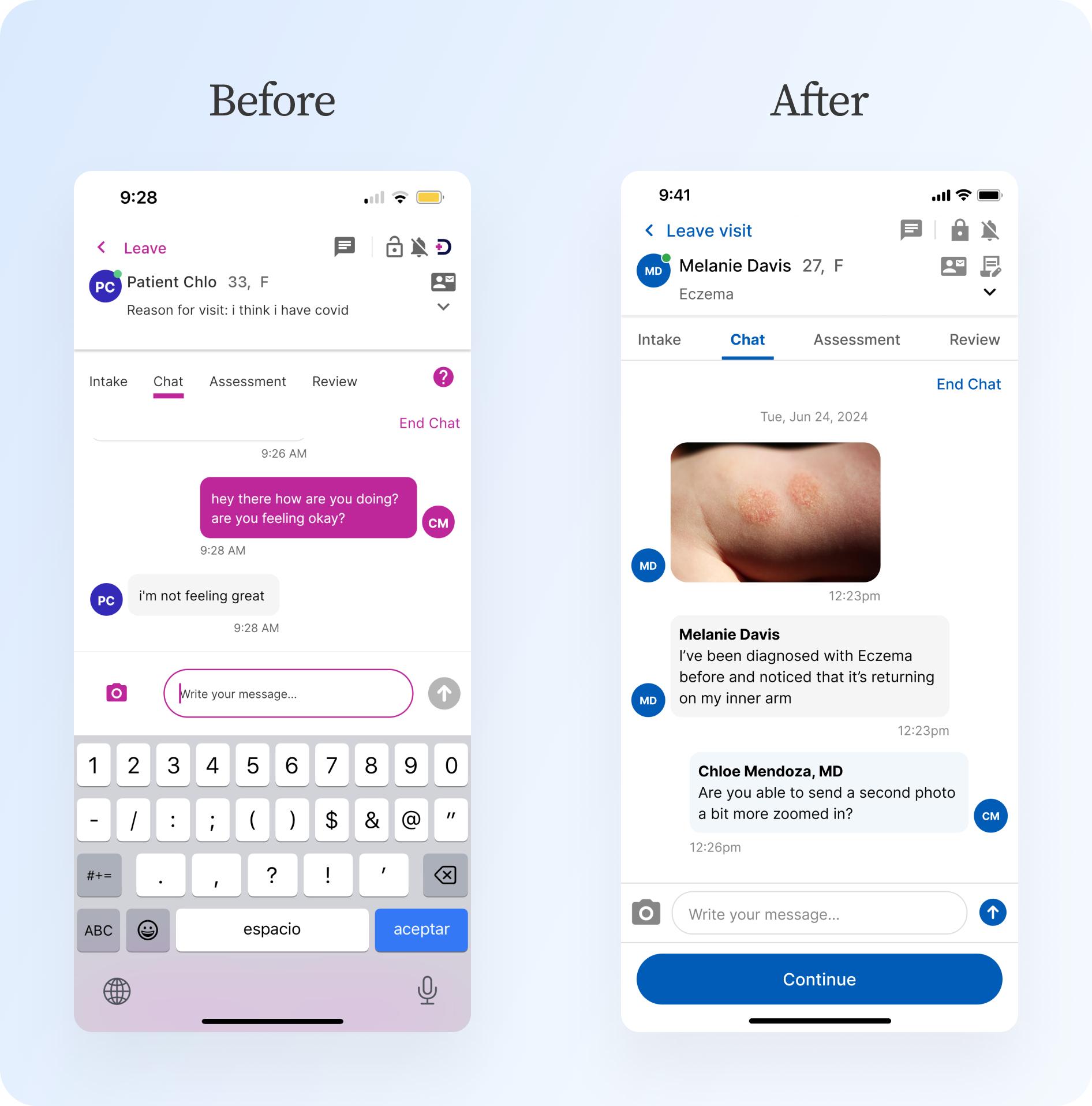
Key improvements to the chat experience included adding the date that messages were sent and showing the sender’s name to help improve clarity. UI improvements included updating the tab bar, the message bubble colors, and the input bar with icons.

Sample of net new features
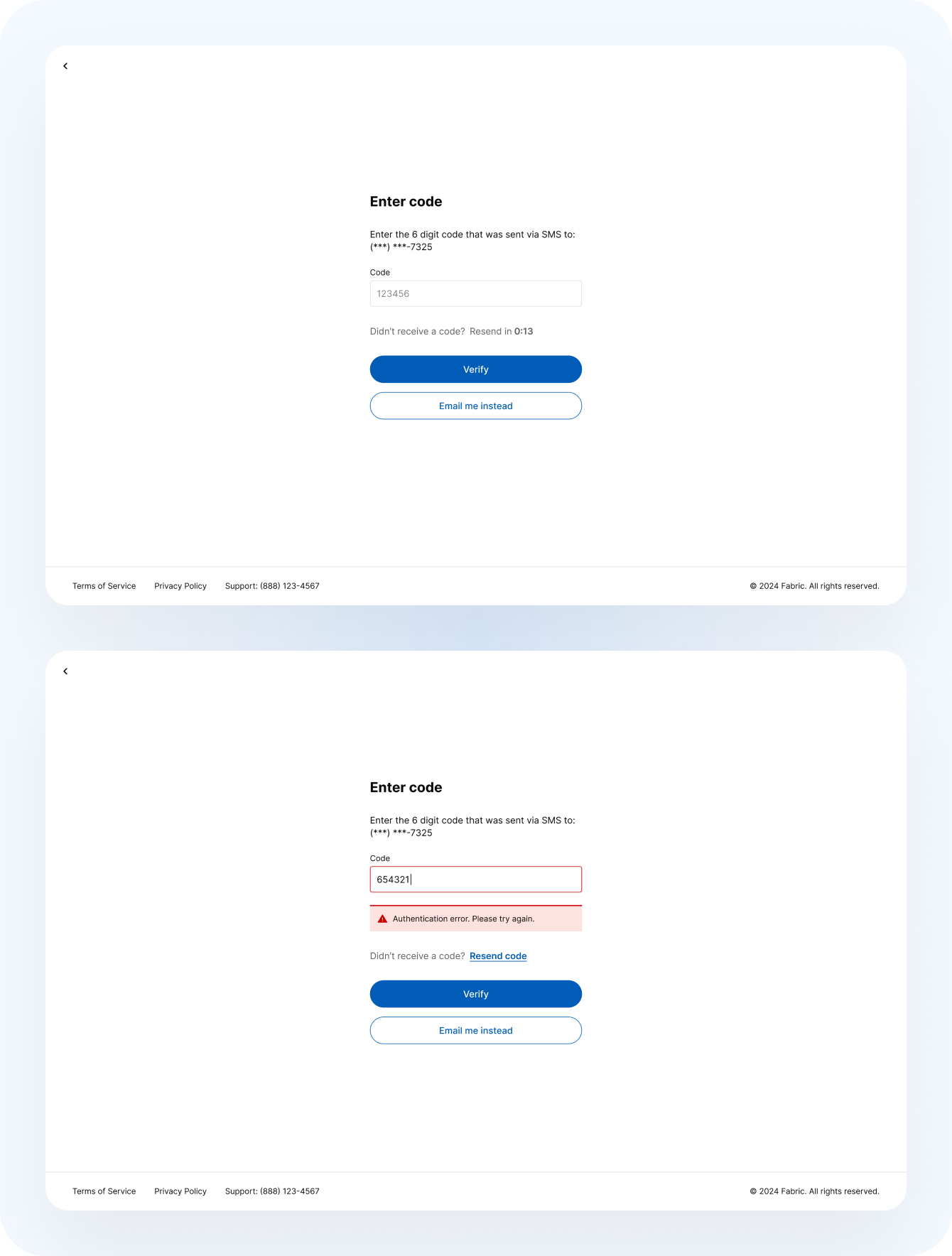
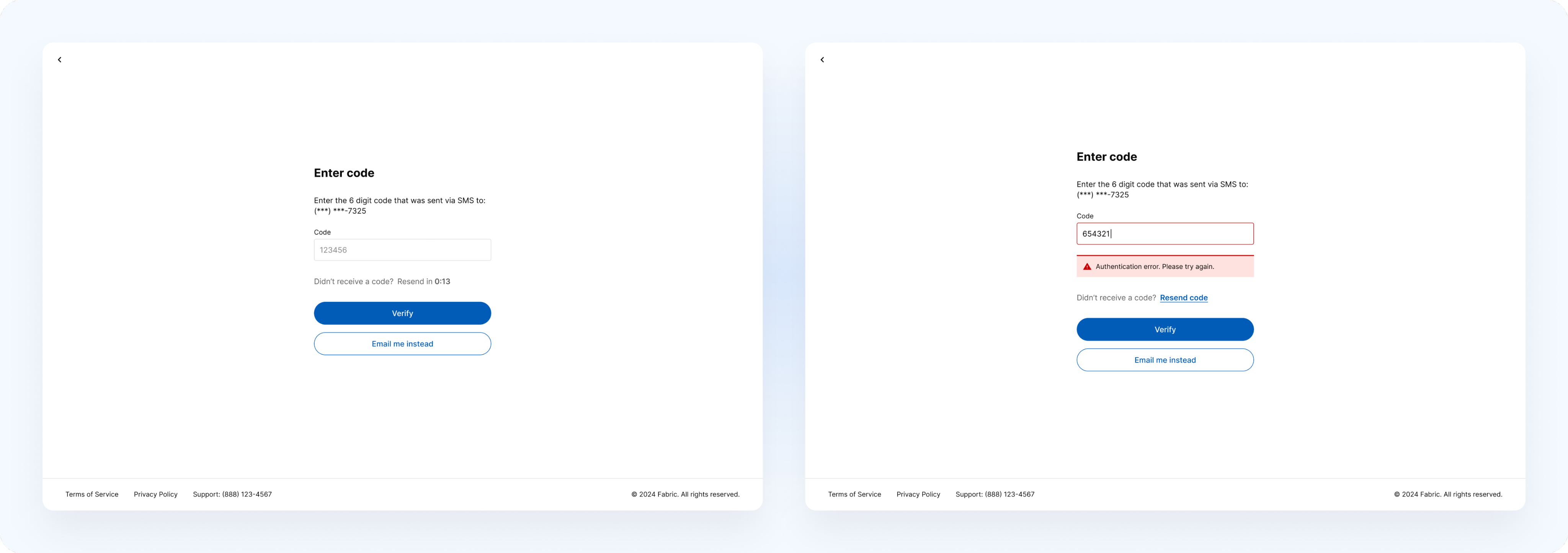
The introduction of two-factor authentication was big. While a relatively straightforward feature, I worked with frontend, backend, and security teams to ensure that provider logins were kept safe and patient information would stay protected.
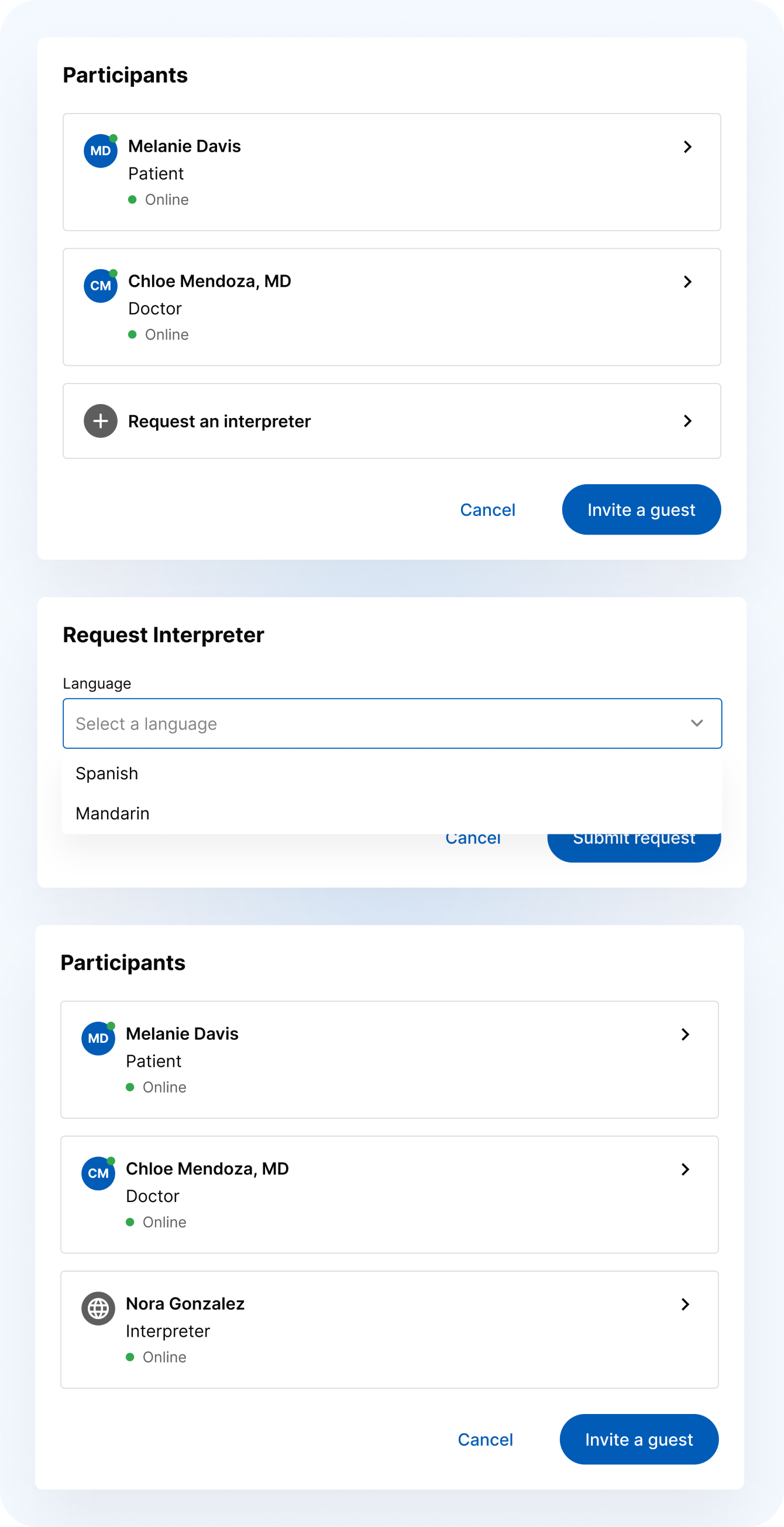
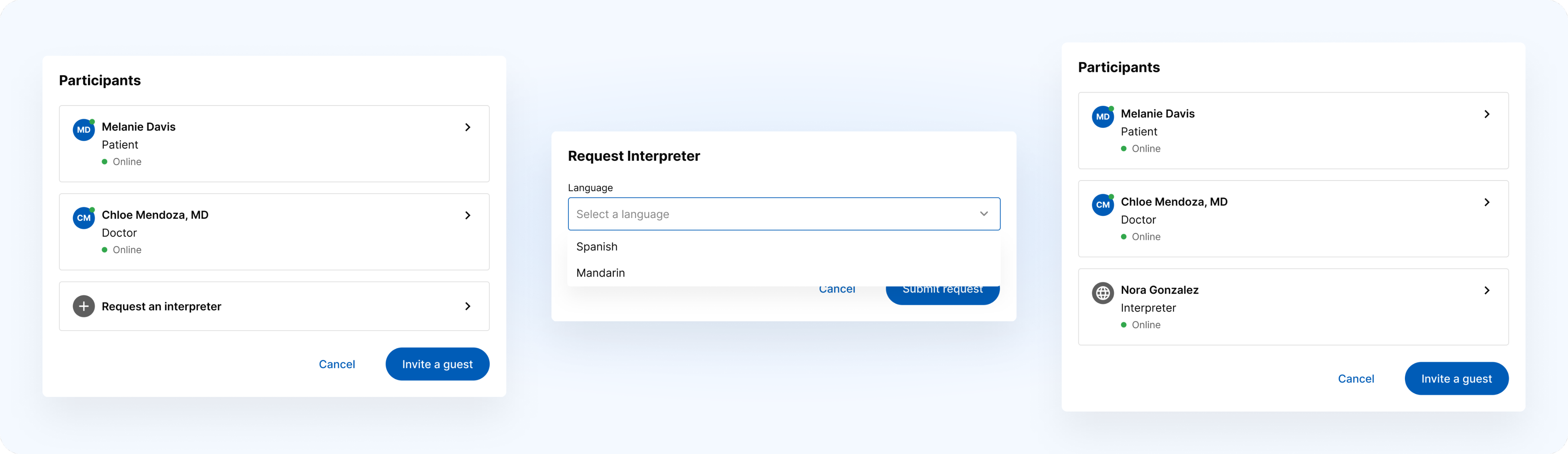
A new feature saw us introducing the ability for a provider to request an interpreter from a 3rd party interpretive services provider. Providers are able to do this through the participants panel, selecting the language for the interpreter and viewing the details of the provided interpreter.
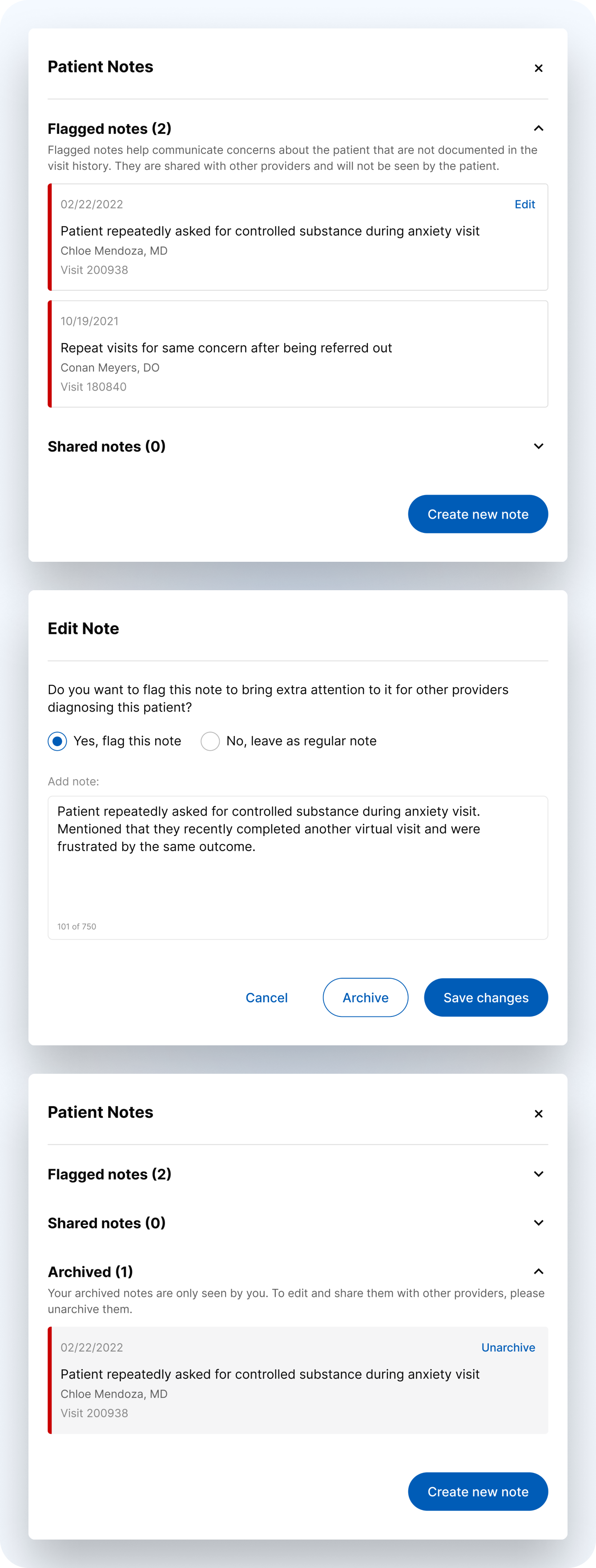
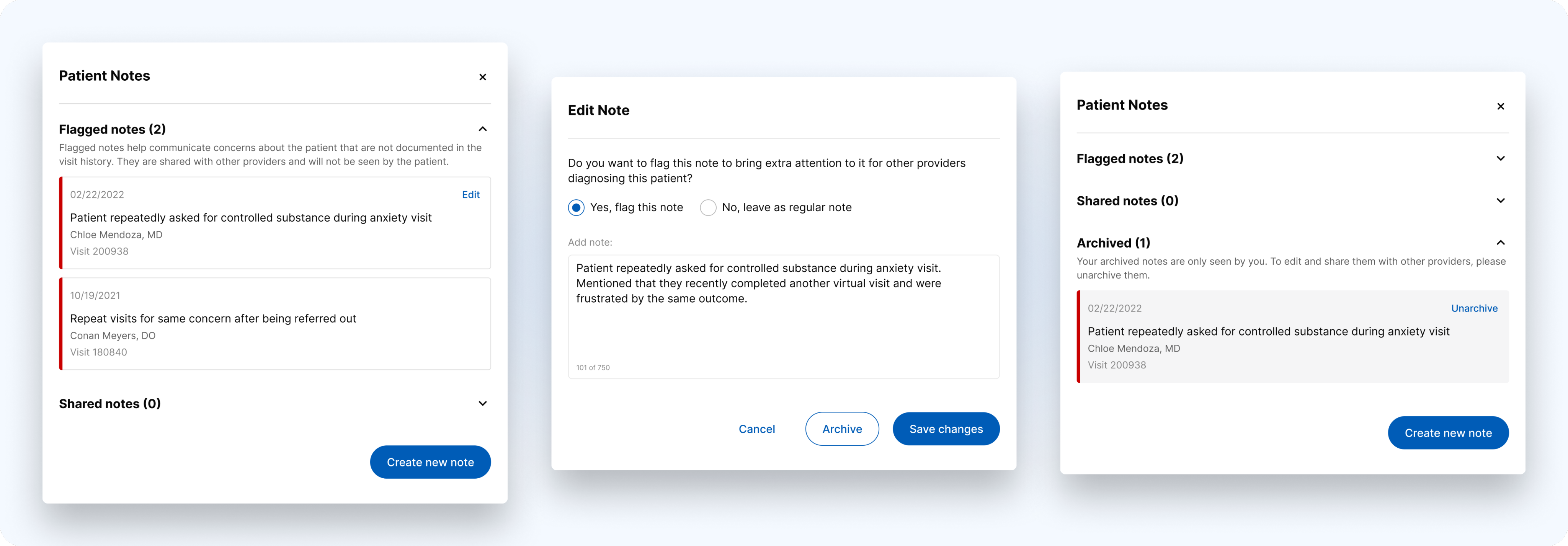
Adding the capability of adding private notes about patients gave providers the ability to communicate privately about patients, and signal areas of concerns for other providers in the future.
PROVIDER ENHANCEMENTS
Upgrading the application by adding new features and improving the existing experience

Dates
Apr 2023 - Aug 2025
Role
Design
Overview
In the two and a half years that I worked on the provider application, we completed many enhancements and new features. Some of these were self-initiated, some were driven by product, and a number came as product enhancement requests from customers. The scope of these projects ranged from smaller items, such as adding patient pronouns, to larger “mini epics”, such as developing and enforcing font styles across the application.

Sample of enhancements to existing features
I updated the queue to improve accessibility and scannability, making the first step in the diagnosis process more efficient for providers. Moving the time indicator bar next to the time waiting made sense of the association, and allowed us to change the time waiting font color to black for all visits. I also cleaned up the online/offline statuses, message indicator, and visit type indicator in the modality column to help providers process this information real quickly. I worked with the engineering team to update the tabs to be more responsive and the page navigation feel more natural. Finally, for visits that are not for a specific condition, I revised the design to show providers a preview of the reason for visit so providers would not have to waste time clicking into the visit to get this information.
Updating the encounter history section helps providers to get a sense of when medications, labs, or school/work excuse notes are included at a glance. Further, improving the status chips makes the history easier to scan through, and moves to specify visits that were referred out by a provider rather than simply being marked as complete - an important distinction when considering medical history.
Inconsistent functionality in the profile screen was begging for an update. Unifying the behavior created a more consistent experience, and reorganization of the architecture created a better understanding of the groupings and allowed for the seamless addition of new features, such as two-factor authentication.
The medication interaction warning needed improvements in the UI and accessibility. I worked with engineering to fix up the alignment and padding, and worked to improve the warnings to meet accessibility standards. Introducing differing icons for the different severities of interactions and giving each warning a background color that would allow the text of the warning to remain black made a drastic difference.
Updates to the diagnosis and video UI helped not only clean up the experience for providers, but also enabled them to have a bigger view of the video player. Bumping the information about contacting the patient into a dropdown beneath the video player helped with responsive behavior, and removed the focus from information that doesn’t get used all that often. Removing unnecessary step indicators next to the modality type reduced clutter, and updating the sidebar behavior of intake details provided a greater affordance.
A quick clean up of the schedule page on mobile made a big change to the experience. I consolidated events to make the cards match the desktop experience, which also enabled me to group multiple events by day. Adding the ability to scroll up to view previous days also eliminated the need for the checkbox to include past events, creating a seamless scrollable calendar experience.
Key improvements to the chat experience included adding the date that messages were sent and showing the sender’s name to help improve clarity. UI improvements included updating the tab bar, the message bubble colors, and the input bar with icons.

Sample of net new features
The introduction of two-factor authentication was big. While a relatively straightforward feature, I worked with frontend, backend, and security teams to ensure that provider logins were kept safe and patient information would stay protected.
A new feature saw us introducing the ability for a provider to request an interpreter from a 3rd party interpretive services provider. Providers are able to do this through the participants panel, selecting the language for the interpreter and viewing the details of the provided interpreter.
Adding the capability of adding private notes about patients gave providers the ability to communicate privately about patients, and signal areas of concerns for other providers in the future.