Problem
A high percentage of users never select a protocol.
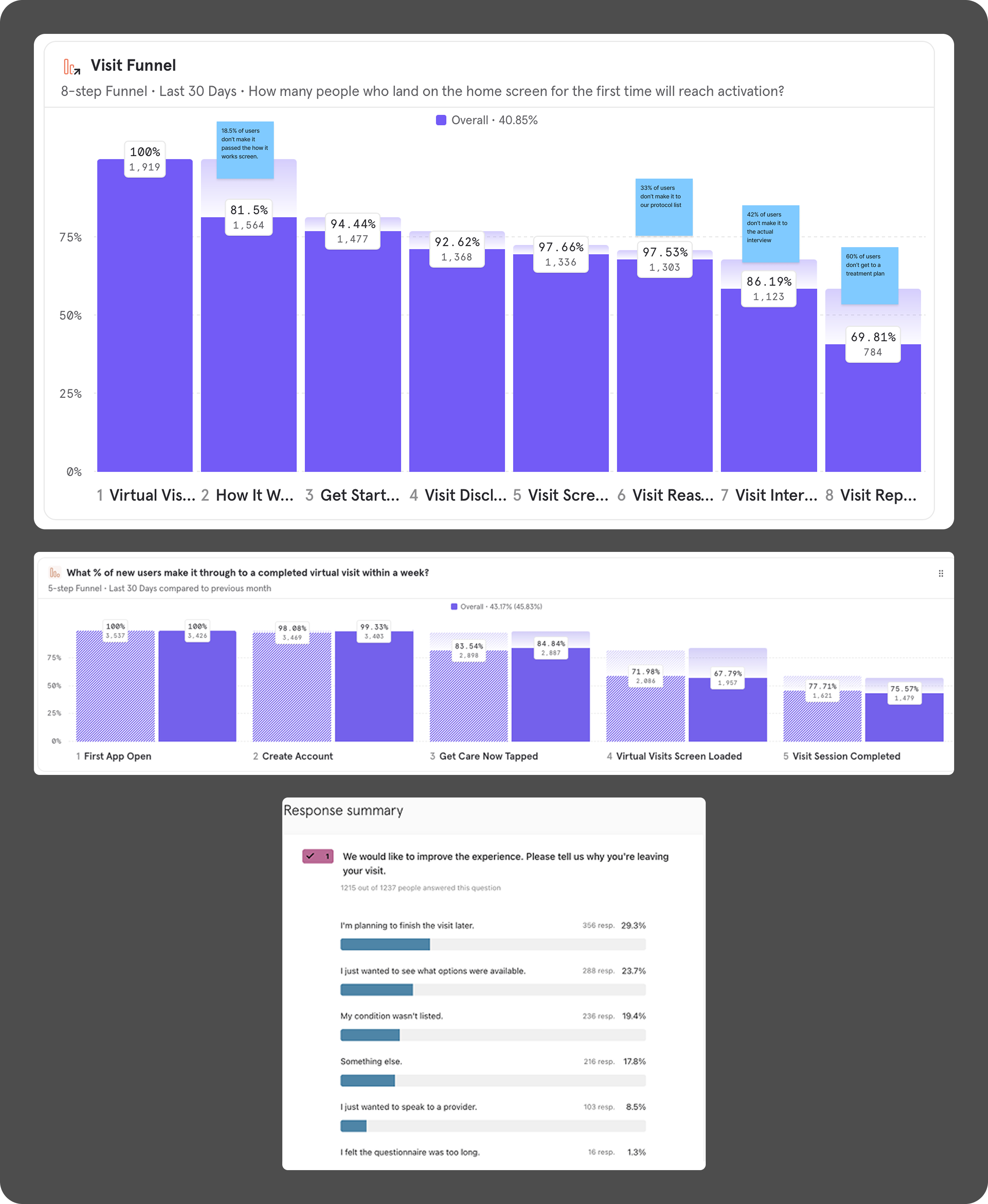
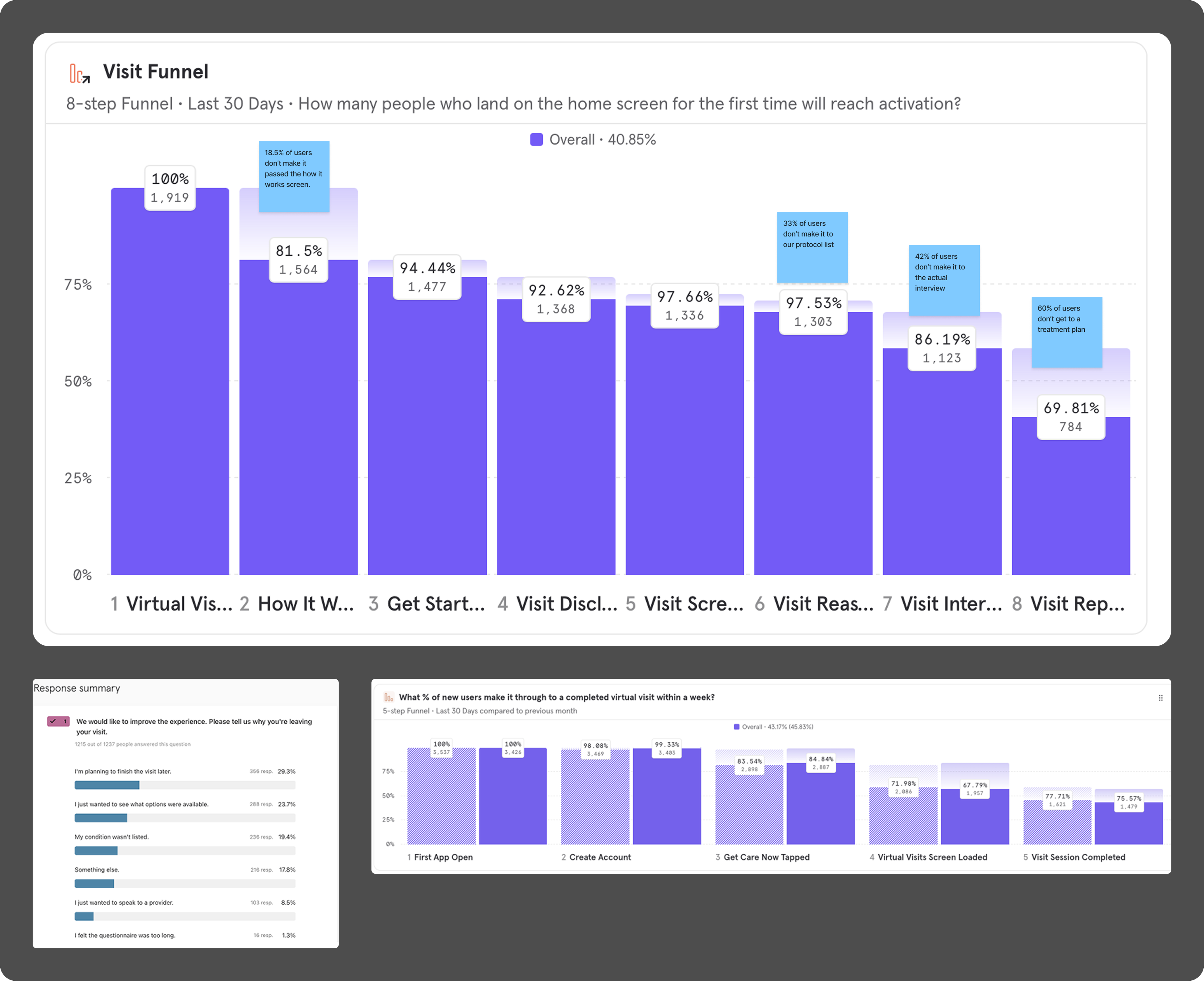
We were seeing a high level of drop-off between users clicking the initial button to get care and them actually starting a virtual visit, with data showing that 32% of our users were not making it to see our list of conditions. Of the users that did make it to the list of conditions, another 10% did not start a visit.Feedback showed that 24% of these users stated they just wanted to see what options were available, while another 19% could not find their condition in the care options even though we offered protocols to treat some of those conditions.This experience required a level of seeking and commitment that might prevent some users from getting the care that they need.
It previous took 10 clicks for a user to understand the types of care we offer
Goal
Increase number of completed visits and reduce visit abandonment.
Moving the list of conditions upfront would help users to better understand how DocSquad could help. Reformatting so that a sampling of the conditions in each category are displayed would allow for greater exploration and alleviate struggles of users not finding the condition that they needed.
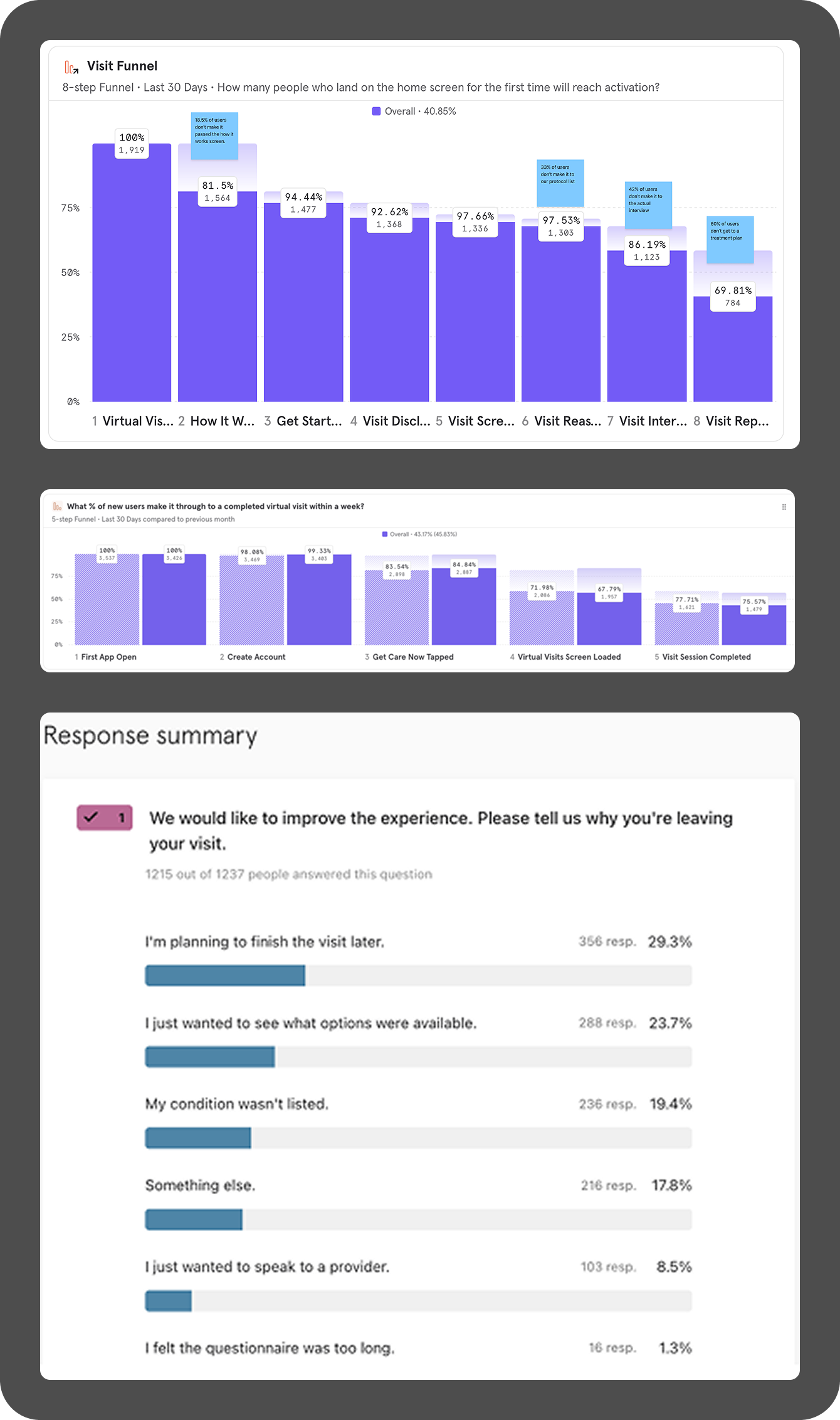
Identifying points in the experience where drop off occurs
Challenges
Demographics affect condition eligibility and edge cases are plentiful.
Four pieces of information are required by the backend to begin a visit:
- Current location (U.S. state)
- Age
- Sex at birth
- Insurance group (for enterprise clients)
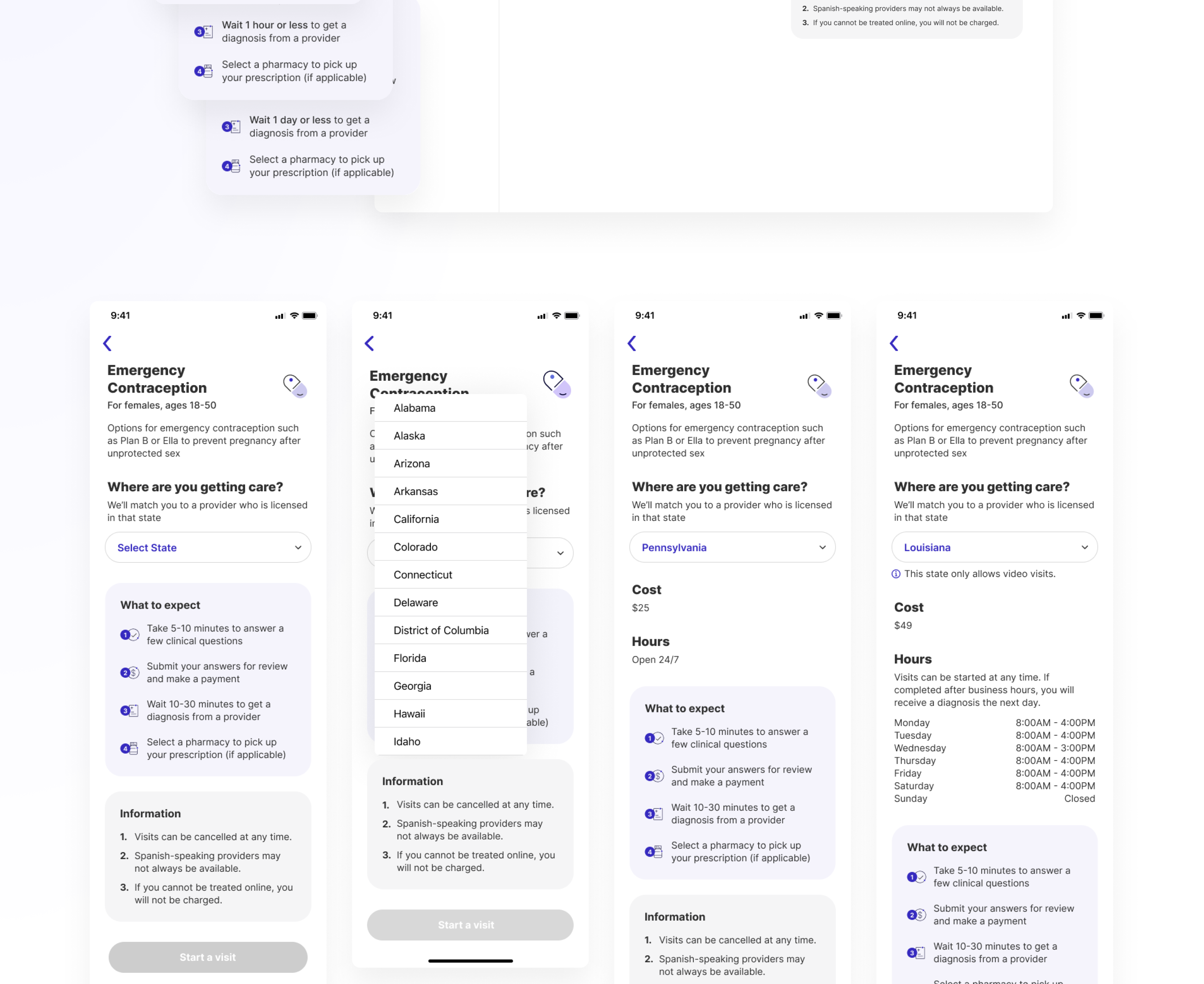
Our main consideration was how to allow users to explore the conditions while still providing them with accurate details, since the four pieces of information could influence visit availability and eligibility.There were a number of other challenges based on the variety of enterprise clients, edge cases, and technical limitations. Key challenges included (but were definitely not limited to):
- Visit modality limitations based on state
- Incorporating custom text strings for both cost and hours
- User needing to select the location they are in at the time of the visit
- Deep linking to condition details pages
Importantly, because we were not touching the virtual visit and treatment plan sections at this point, we strived to maintain a visual language that would feel consistent with the rest of the experience.
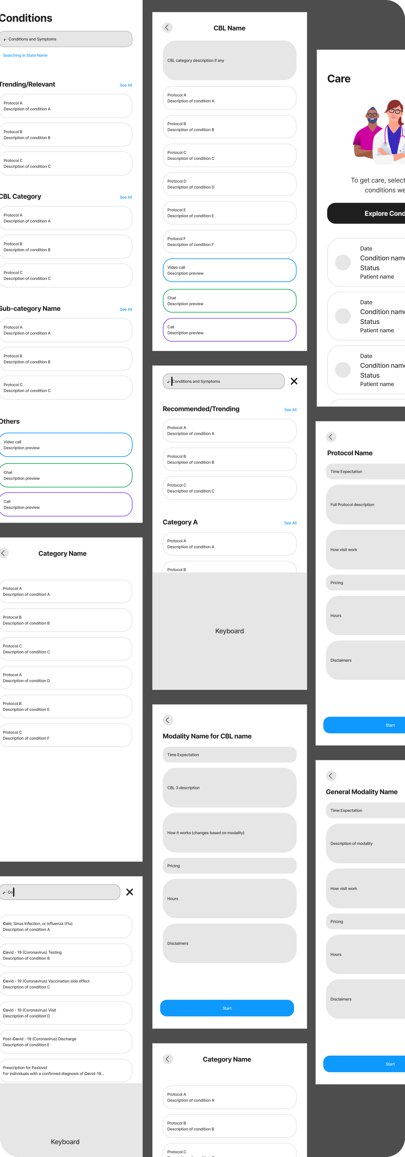
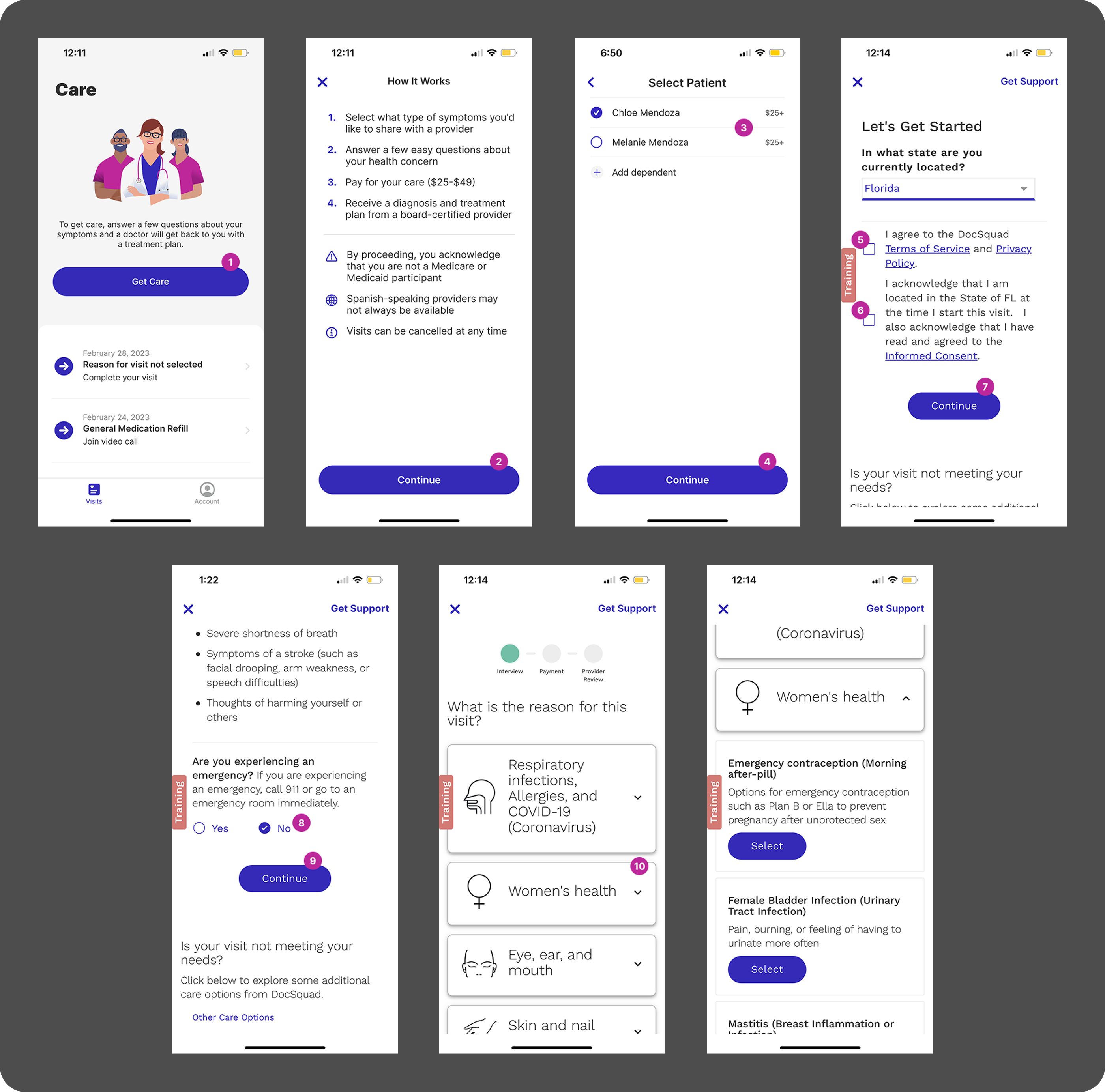
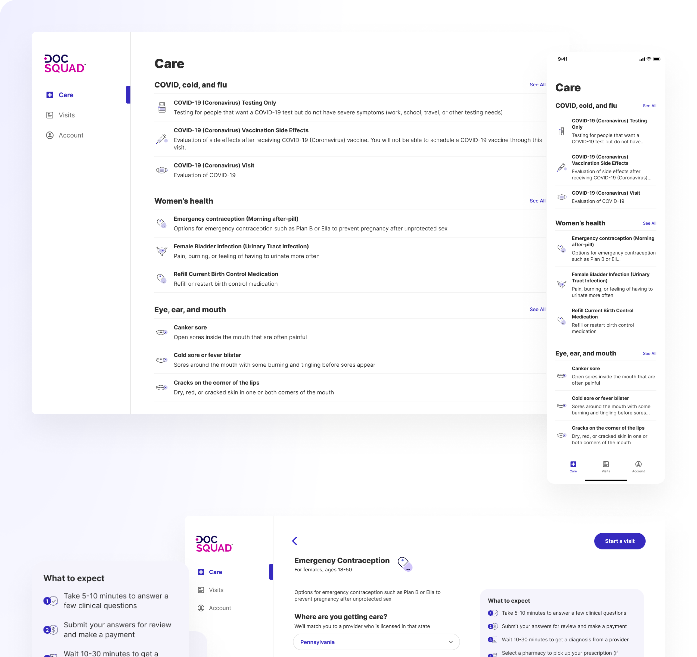
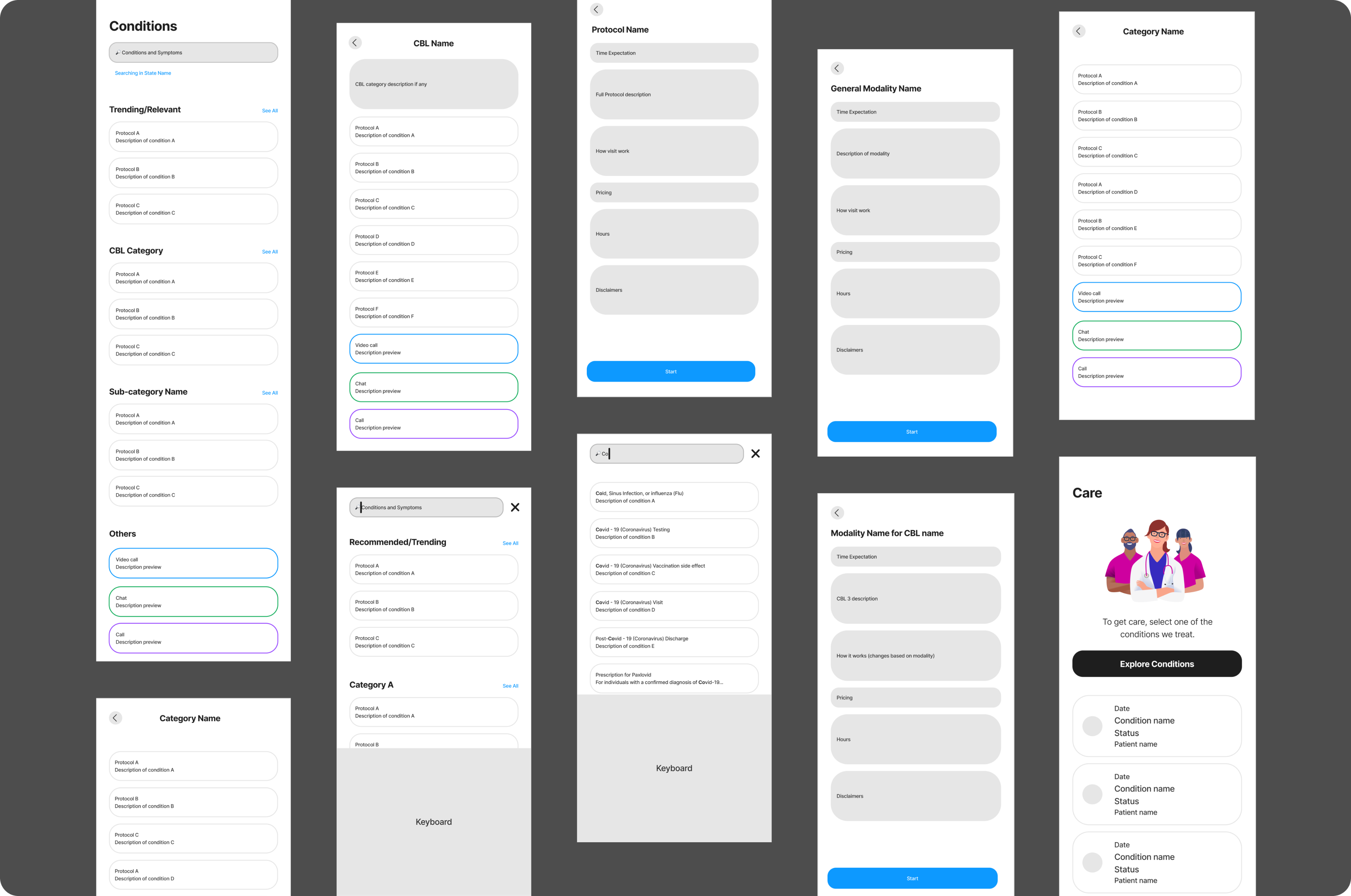
Initial wireframes to bring the conditions up front
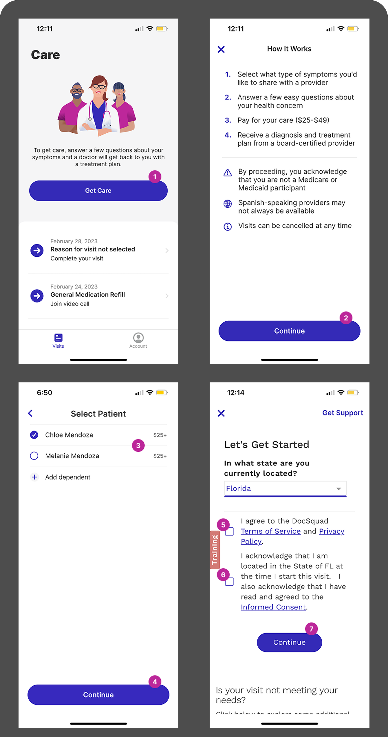
Initial Solution
Bring conditions and state/patient selections to the front, followed by key information.
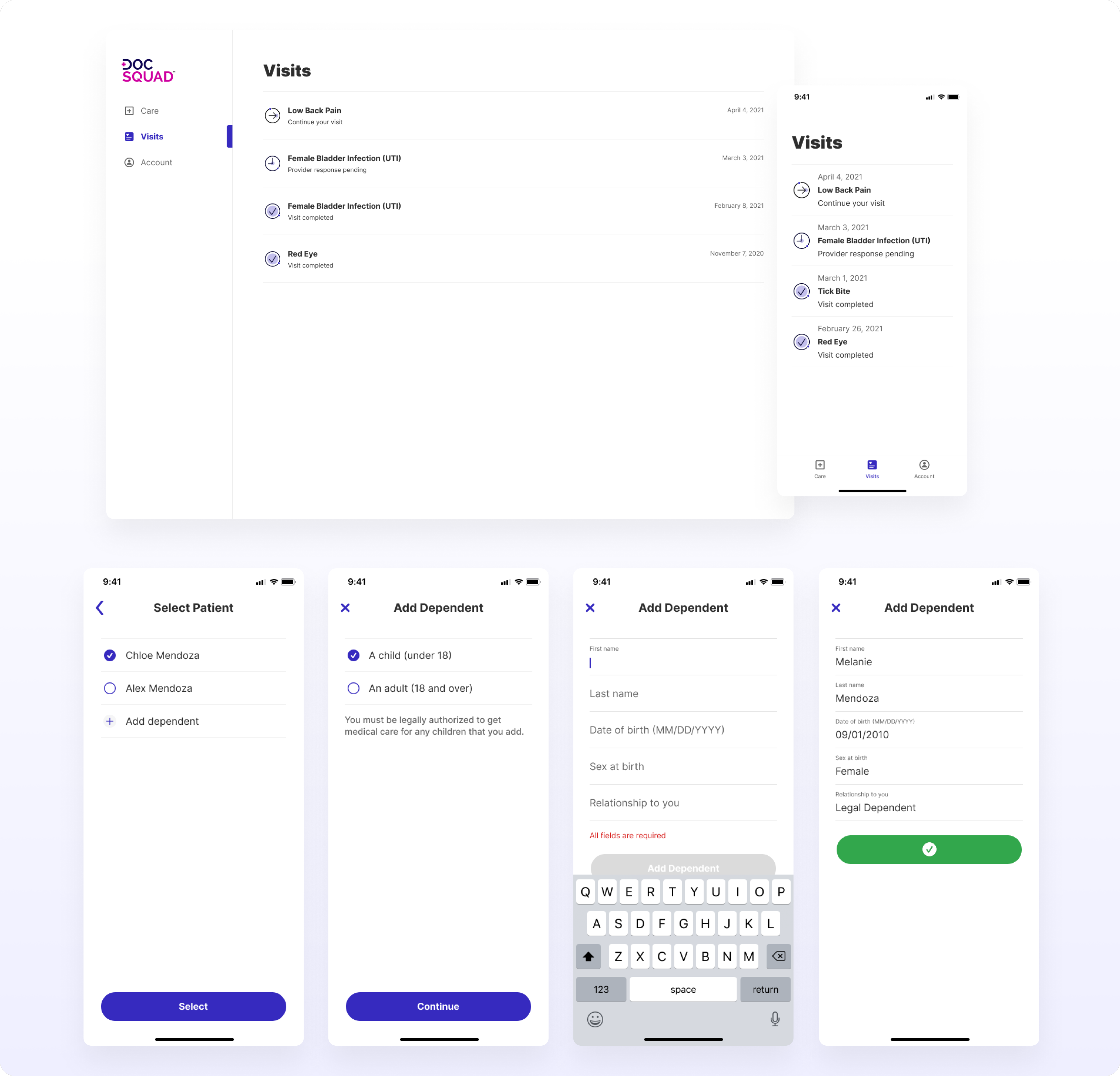
We reorganized the tab structure to include three tabs in total:
- Explore available conditions
- View and access visit history
- Account-related items.
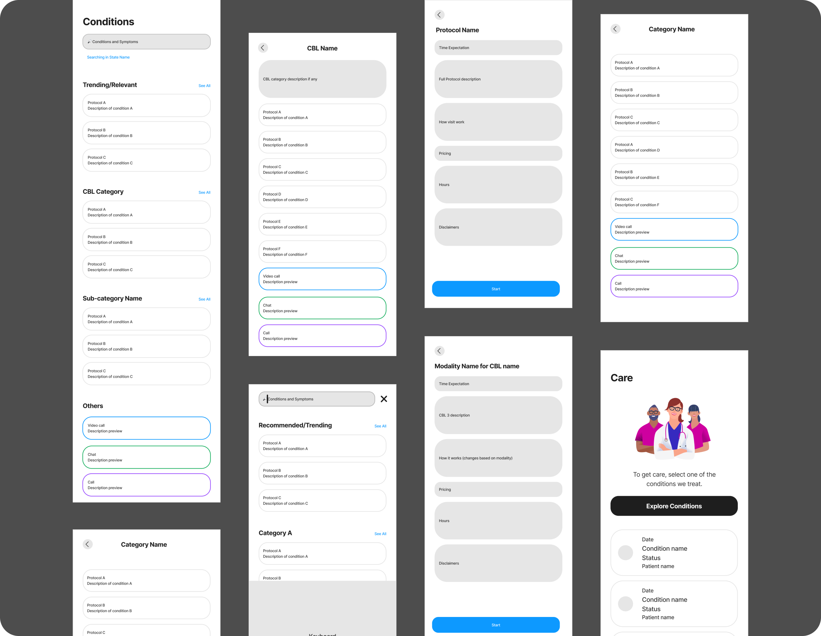
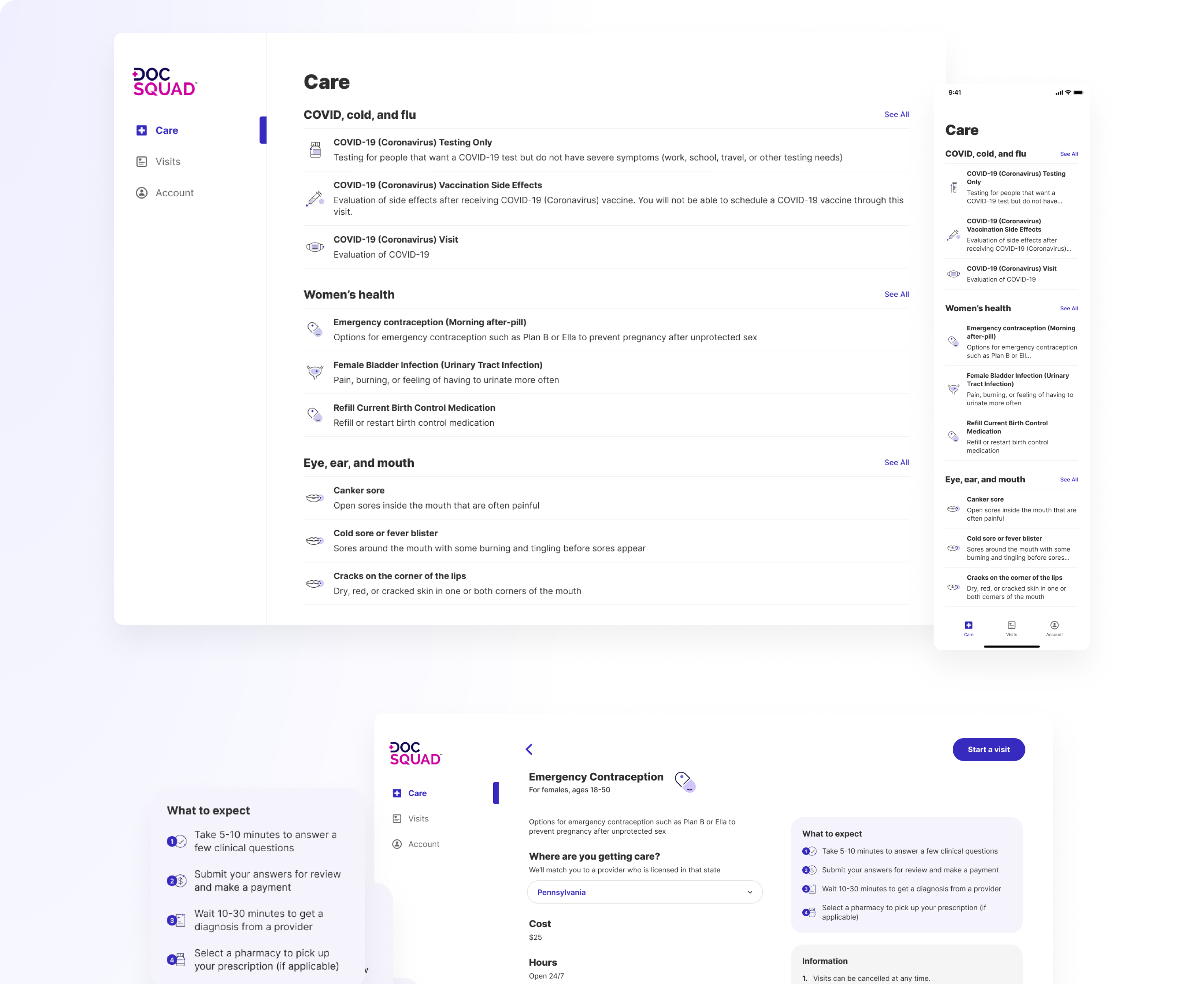
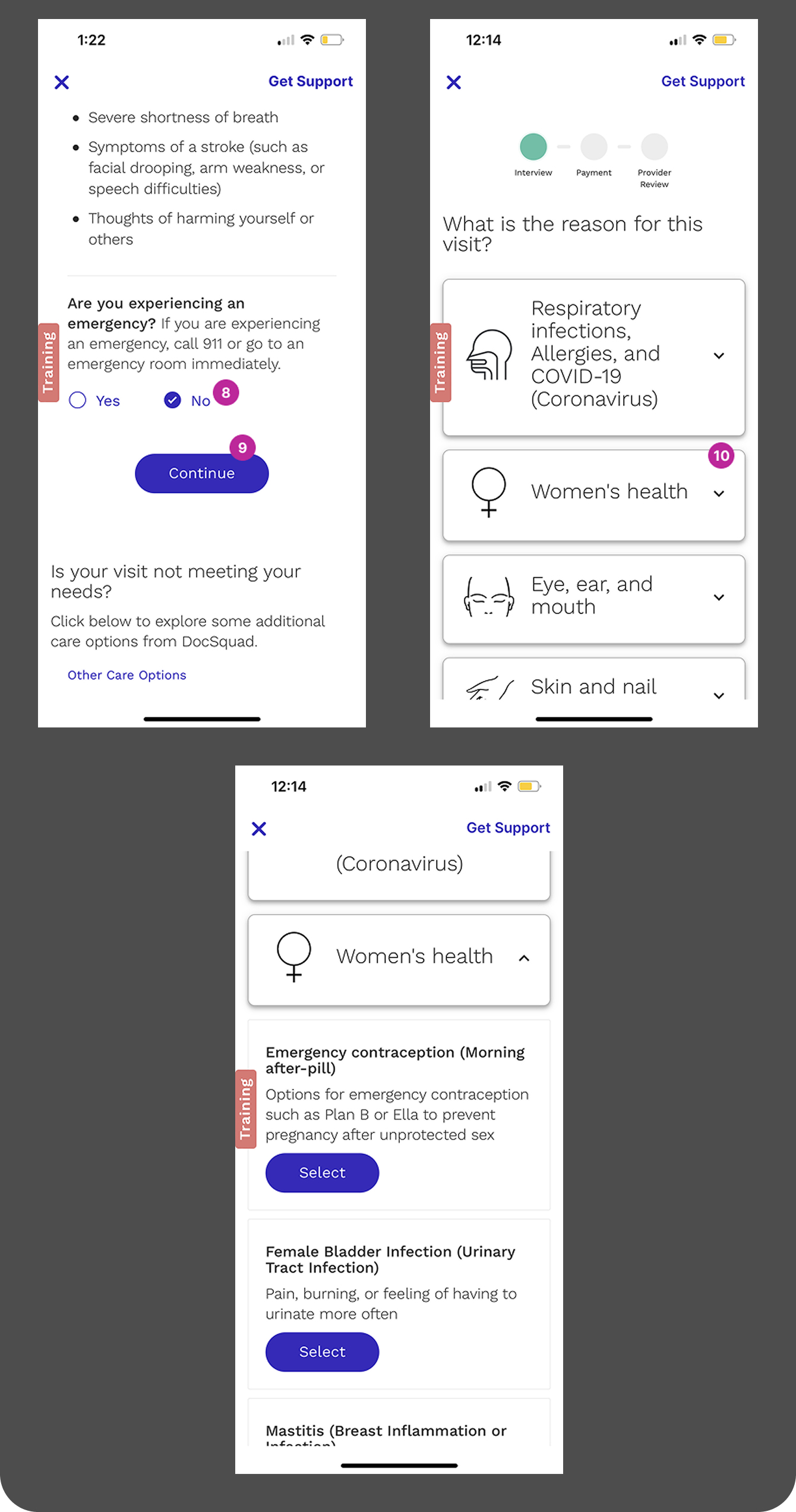
Focusing on the experience of exploring available conditions, we worked with the clinical team to group similar conditions and allow them to live in multiple categories for easy exploration. We highlighted 3 protocols in each category to help give users an idea of where their condition might be found to help reduce abandonment. We put the state and patient selection on the main Care tab to customize the protocols that we were displaying.Another main goal of this redesign was to bring all the key information about a visit that was scattered throughout the experience to one single location. This included information such as the condition name and description, cost, clinic hours, age/sex restrictions, what to expect, and any information or disclaimers. We made this information accessible upon clicking on a condition.
User testing designs and findings
Usability Testing
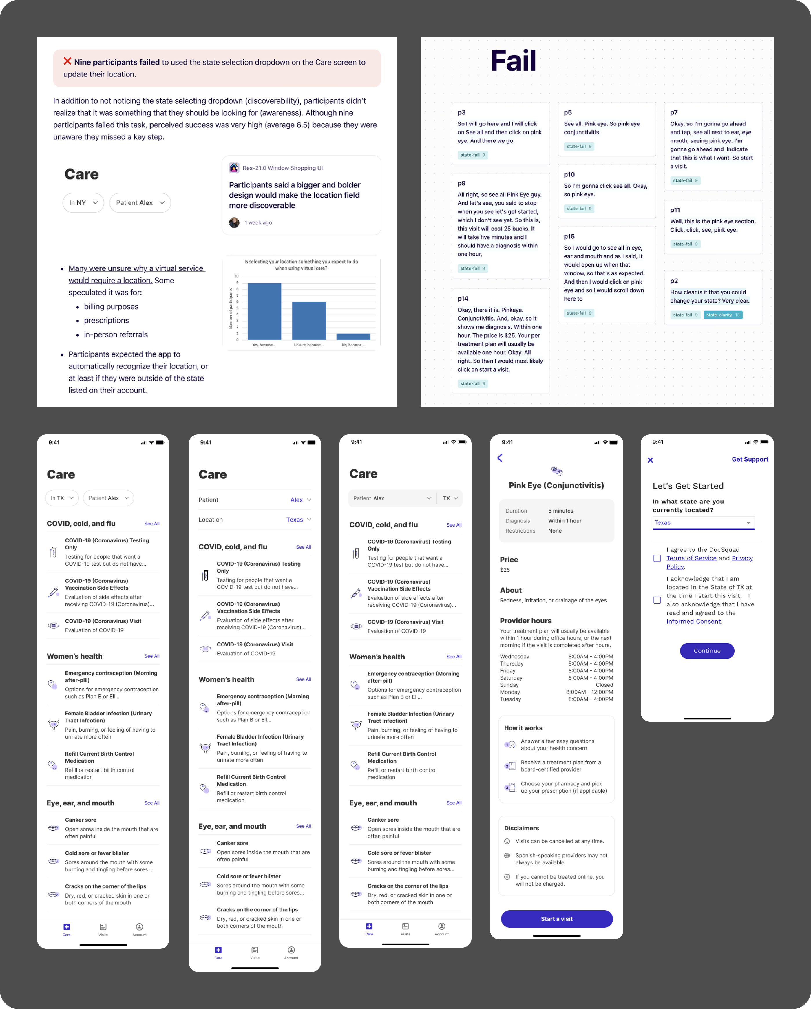
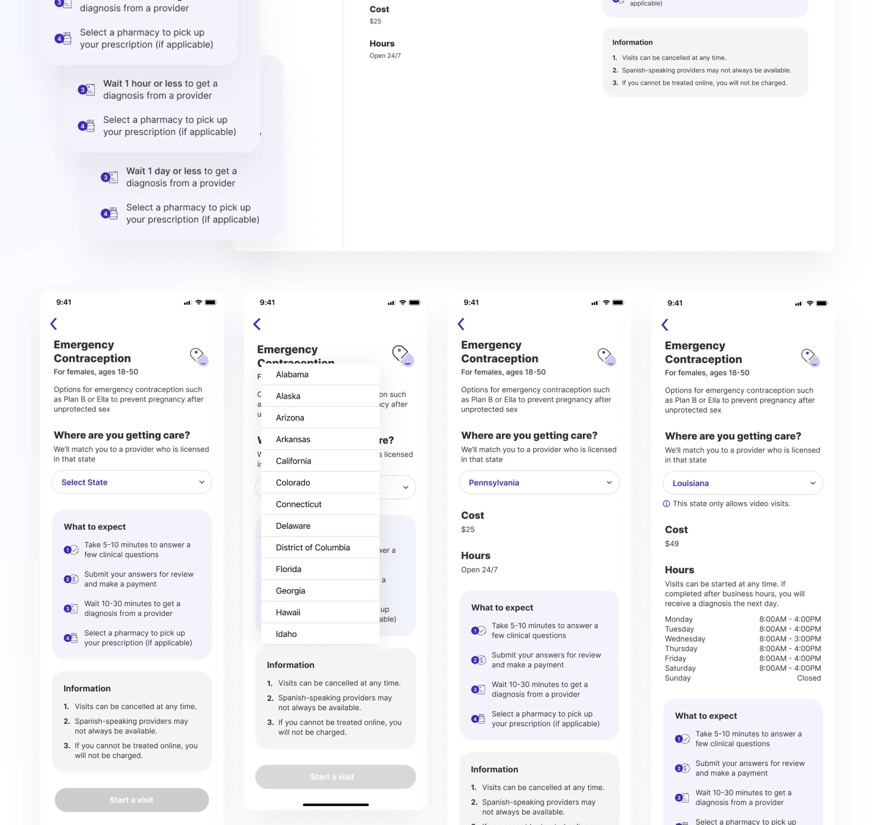
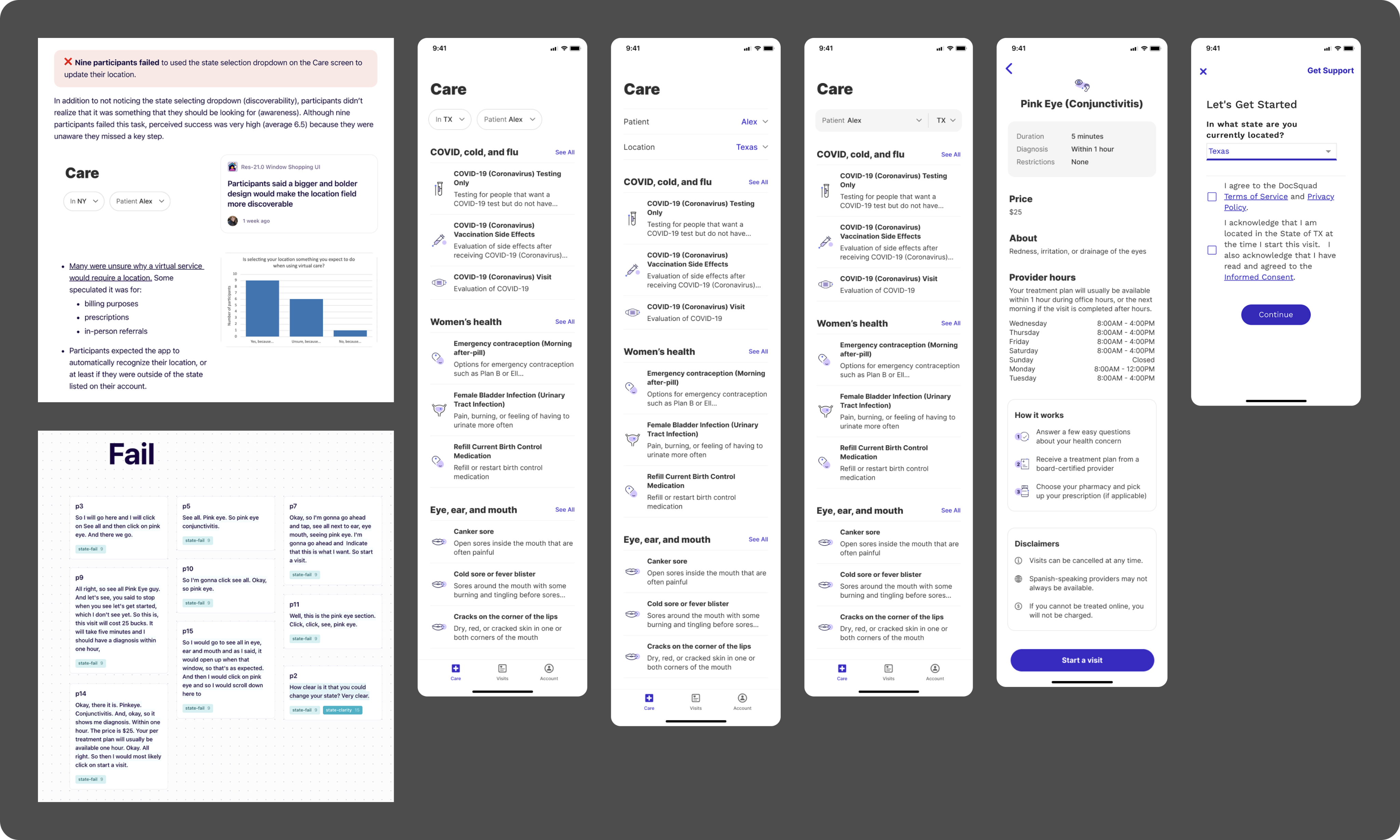
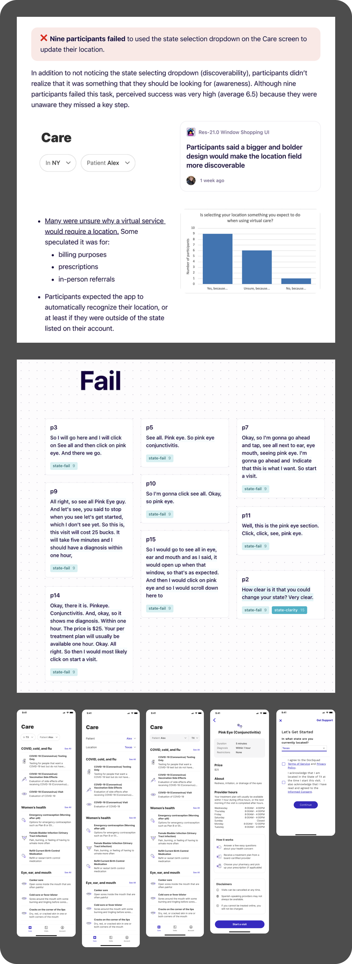
Initial designs of state and patient selectors had problems with discoverability.
We worked with our researcher to do a round of usability testing to look into the following questions:
- Are the proposed UI affordances clear and intuitive?
- Does the proposed UI introduce any new problems?
- Do users understand that the services available to them may vary by their geographic location?
- Which of the design options is most effective?
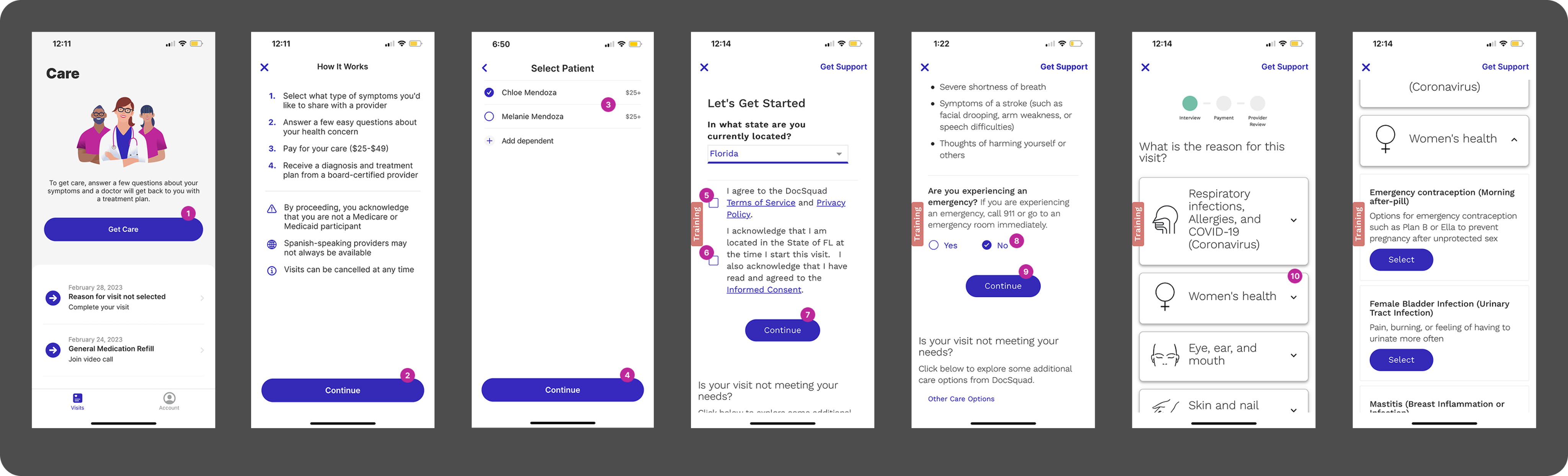
Sixteen participants completed three tasks, as follows:
- Get care for yourself for Pink Eye while you are on a work trip to New York
- Get care for your daughter, Melanie, who has the flu when you are back home in Texas
- Review 3 different designs and explain which provides the clearest affordance for changing location and patient
Findings:
- 9 participants failed to start an out-of-state visit due to problems with discoverability and awareness of the state selector
- Participants expected the app to automatically recognize their location, or at least if they were out of state
- All participants easily found their condition by expanding the appropriate category view
- Participants wanted a search bar to find their condition or symptoms more easily
- Many were unsure why a virtual care service would require their location in the first place
- Three participants failed to select the dependent from the patient dropdown on the Care screen, though these participants also said that they were not accustomed to seeking care for anyone else
- When comparing three design options, most participants said variant A was most effective because it leveraged color, hierarchy, and added visual scale
Post-Research Solution
Bring conditions to the front, followed by state/patient selections and key information.
A lack of discoverability during user testing combined with engineering complexity drove us to reconsider the placement of our state and patient selectors.Moving the state selection into the condition details page simplified the logic around our Care tab for our engineering teams. This also allowed for better discoverability of protocols for users - instead of restricting the conditions seen based on the patient or state, we could instead show all of our conditions. This increased exposure to other conditions that may be needed by other family members in the future.Because age and sex at birth are both tied to the specific user but contain less complexity than location, should an account holder try to begin a visit for someone who does not meet the restrictions listed in the condition detail page, they would simply receive an ineligibility alert upon patient selection. We assumed that this would not cause too much friction, as we believed the categories on the Care tab and the restrictions on the detail page would help limit the amount of ineligible patient selections.We made additional changes to the conditions details screen to make the experience more streamlined for the user. We found in testing that our gray informational section actually created more questions than it answered, so we redesigned to incorporate that information throughout the page, which also reduced complexity for engineering. Our final big change after testing was to inform users on the condition detail page and in the start visit button if their state required a video visit or did not offer that condition.
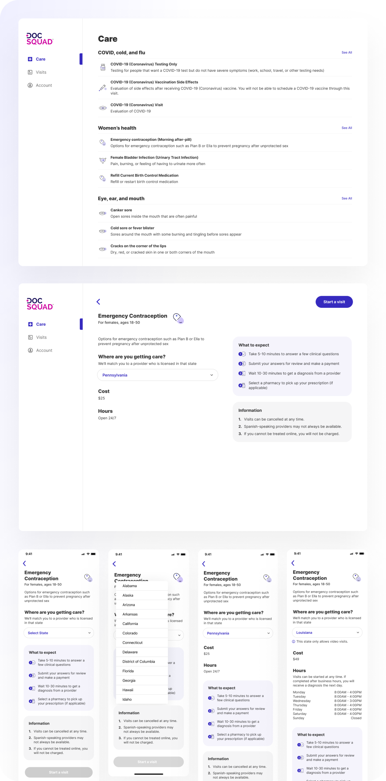
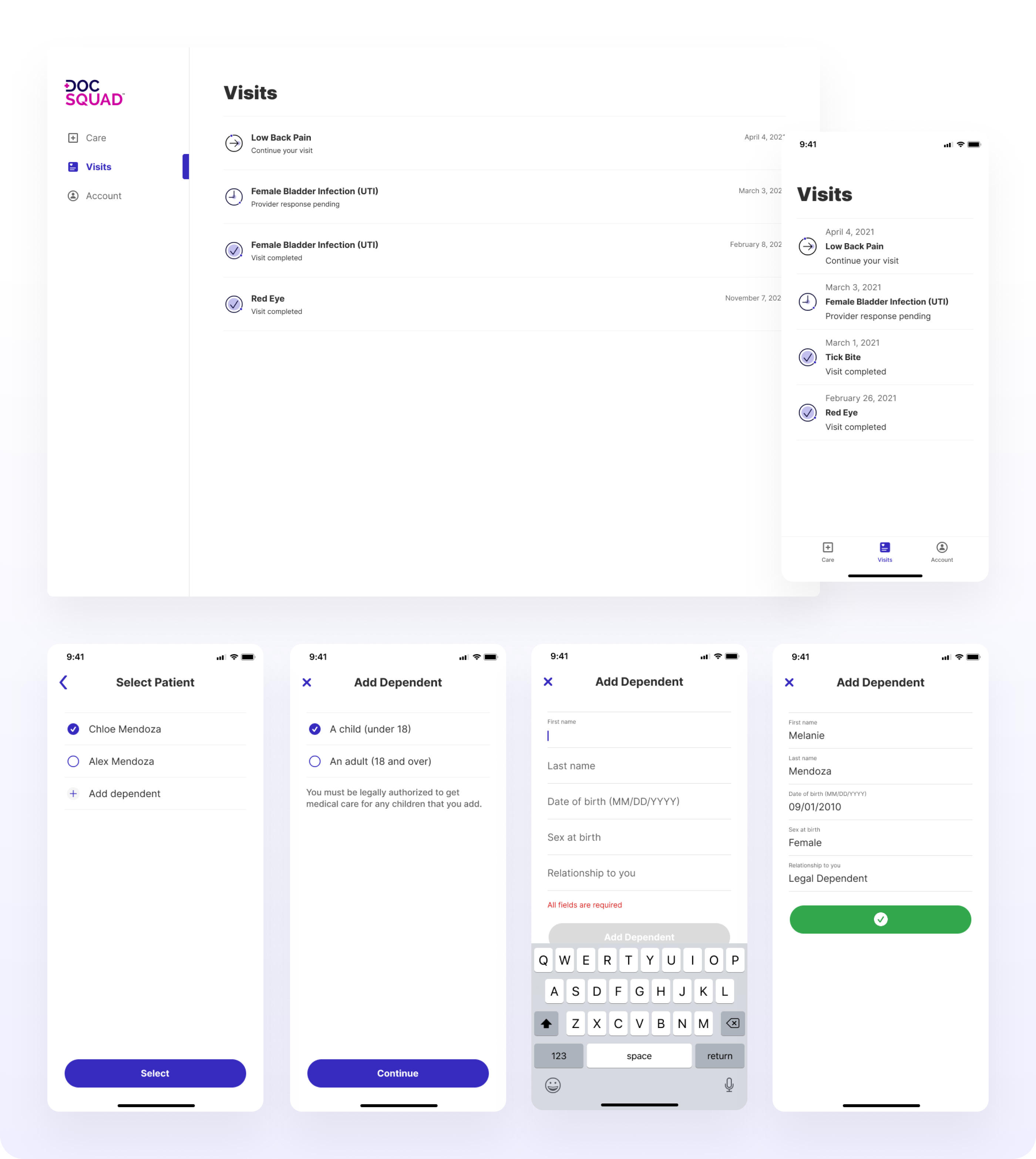
New landing page and entry to getting care
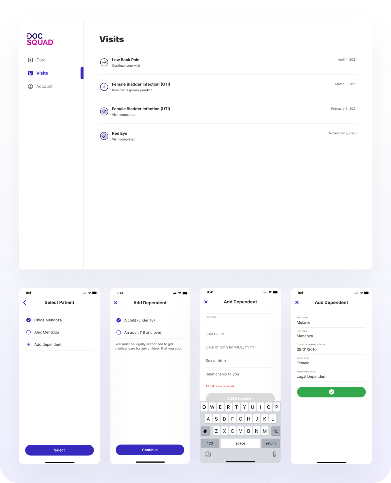
Better visibility of visits and adding a dependent
Lessons Learned
There were a lot of discoveries about requirements that were sporadically being made as we worked through this project. With multiple engineering teams, design, and product all working together, it was sometimes challenging to all be aligned due to the complexity of some of the requirements. In the future, if we were to work on something with such complexity, I would advocate for all teams to work together more closely and more intensely at an earlier stage in the process. I feel this would alleviate some of the pains of having to pivot throughout and ensure that we are designing with as many requirements in mind as possible from the beginning to make such pivots easier on our engineering partners.