Challenge
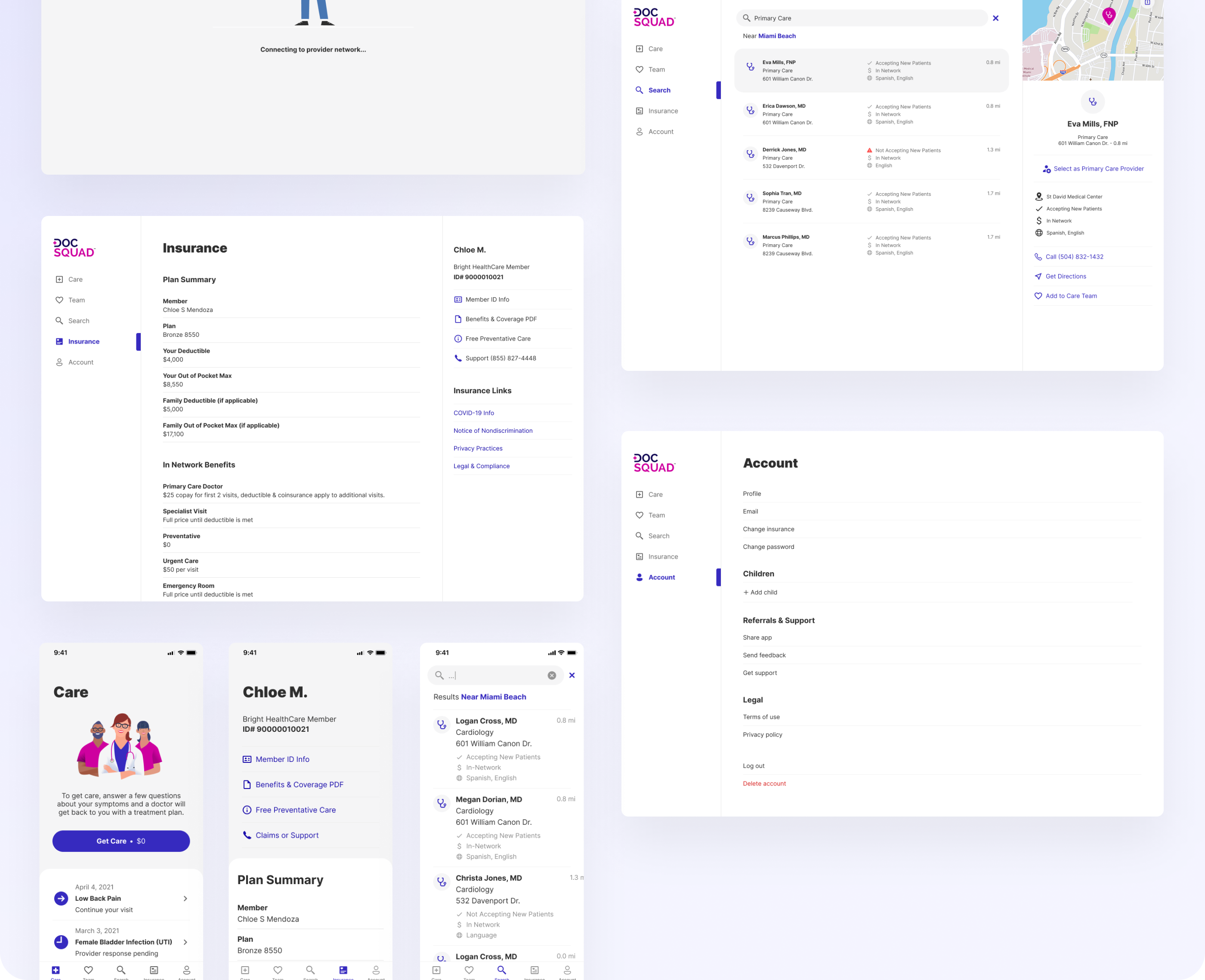
We knew we had to minimize design changes between web and mobile to limit engineering lift. Some of our design decisions, such as confining the onboarding experience to cards, was informed by this, while others were made based on the capabilities of Flutter and routing, such as not having overlays that included drill-down behaviors. The drill-down limitation in particular continued to influence our design decisions on not only web, but also on mobile so that we could have a more parallel experience.
Usability Testing
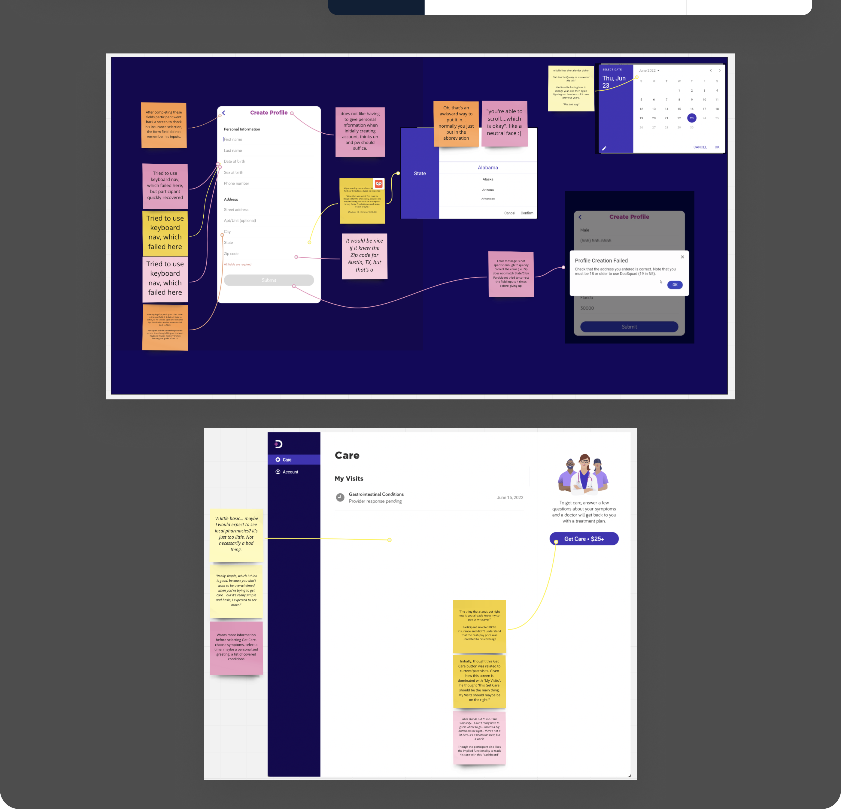
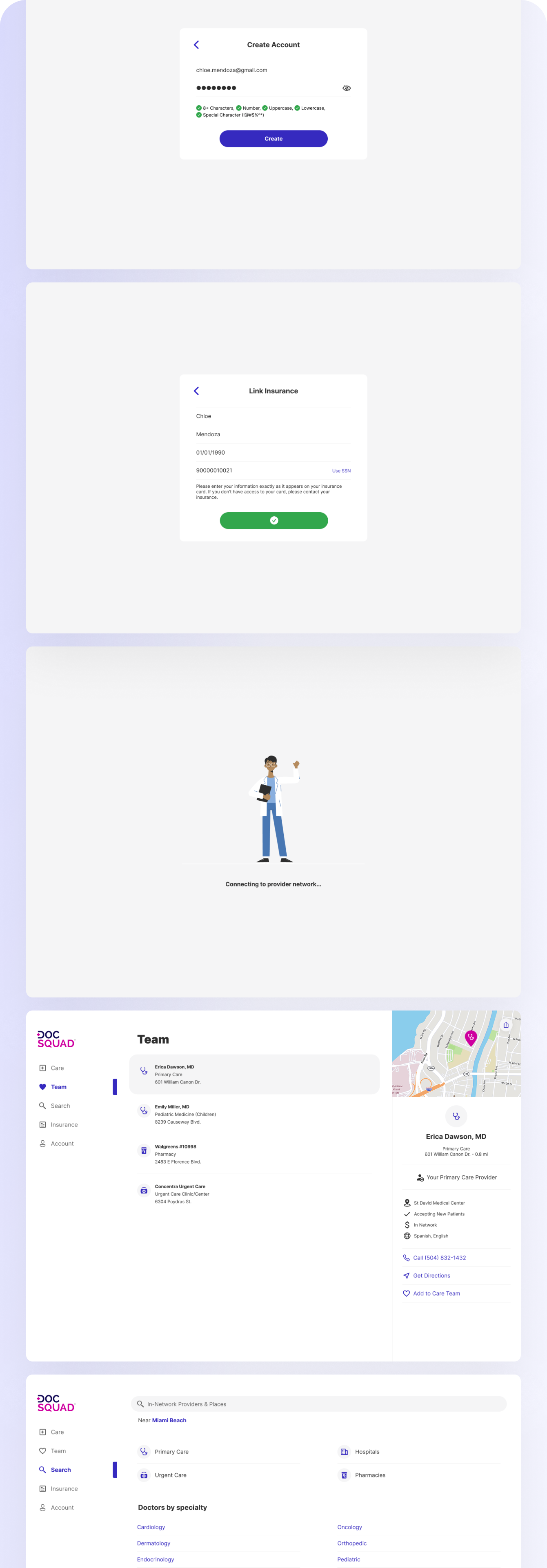
A usability test was conducted on an early production version of the website to understand how real-world users would complete tasks in DocSquad and to identify any non-critical usability problems that we should address in our iterations.
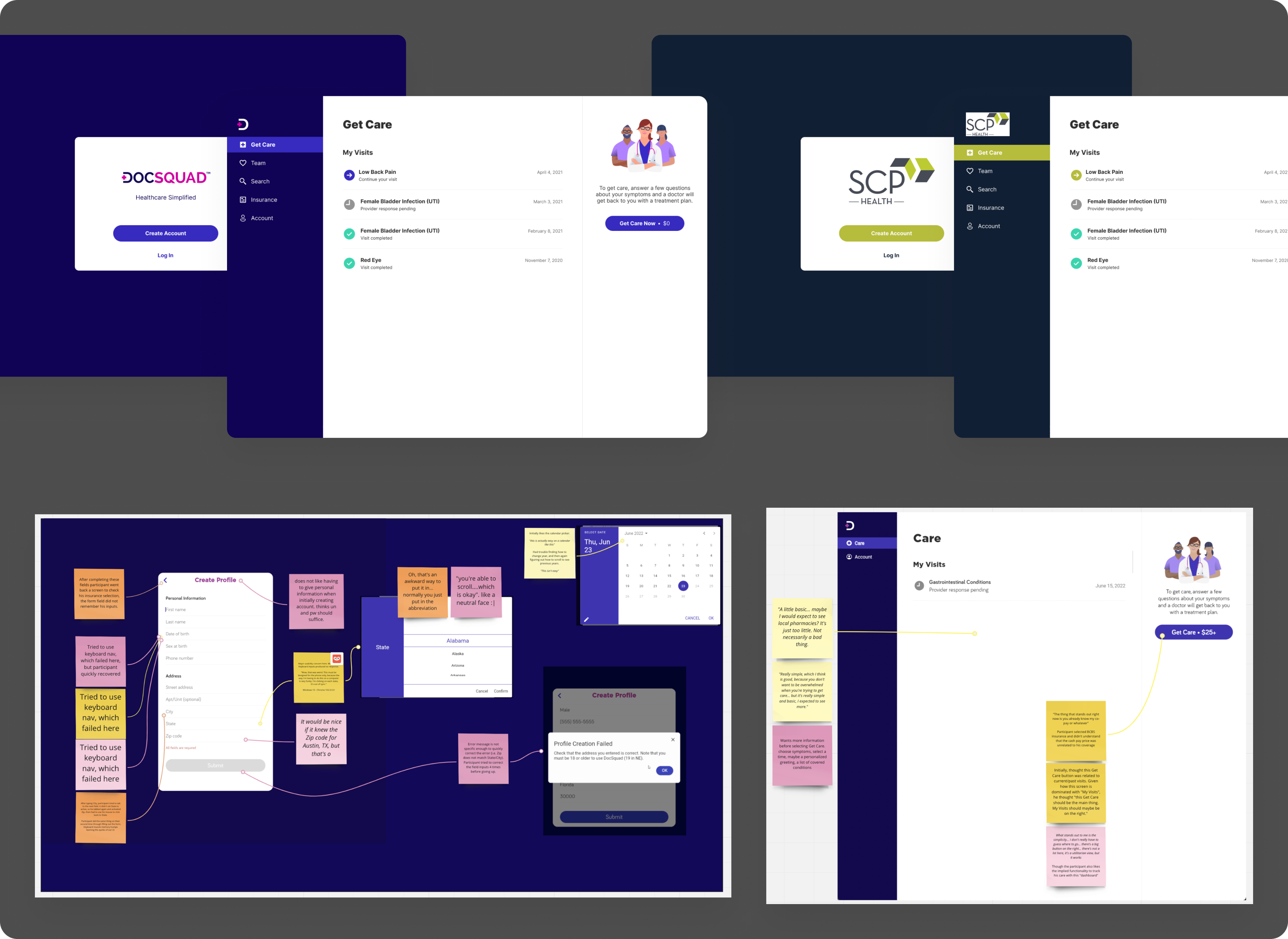
Five participants were asked to create an account on DocSquad and get care for a specific condition using the Online Interview option. Our researchers then grouped their feedback into three separate categories: critical errors, major errors, and minor errors.
Critical Errors:
- No critical errors were discovered during this round of testing
Major Errors:
- No way to edit personal information
- How It Works modal is very text heavy
- Other issues resolved by engineering, such as state selector not working as intended and a hidden scroll bar
Minor Errors:
- Four participants tried to use keyboard navigation to complete the form fields (related accessibility work had not yet begun during the time of testing)
- Four participants were surprised by the calendar picker to select their date of birth, instead of being able to simply type it in
- Participants did not necessarily understand the $25 indicator in the Get Care button - they were unsure when they would have to make the payment and some thought this was their insurance copay.
- The empty homepage had mixed reactions from users - while some appreciated the clarity of how to proceed, others would prefer to have more information, such as a list of conditions
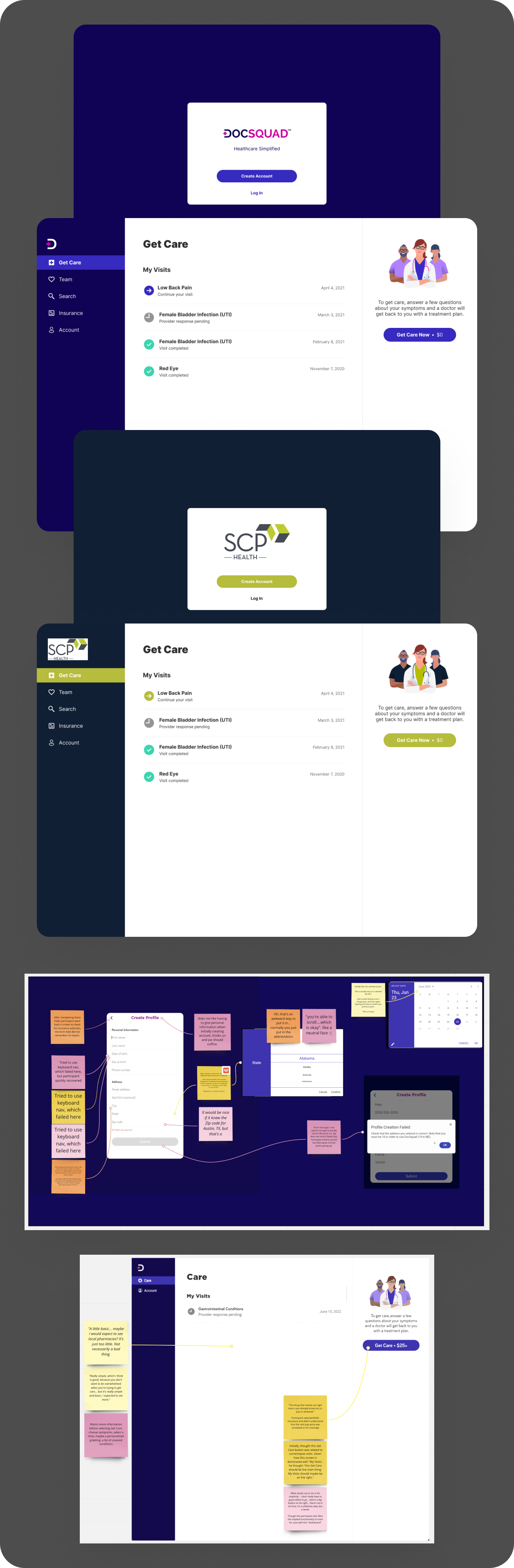
Mockups and feedback from initial user testing
Solution
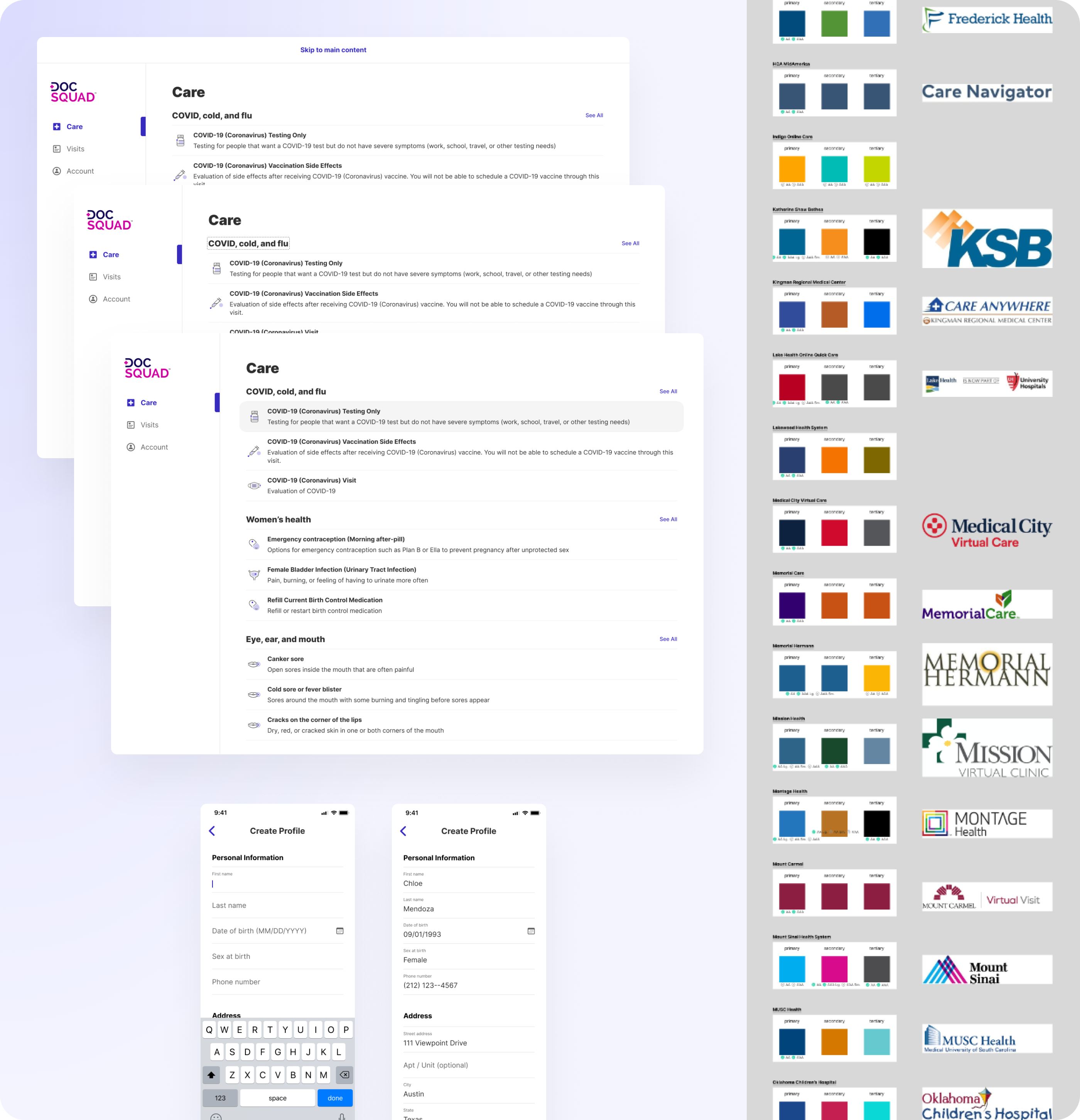
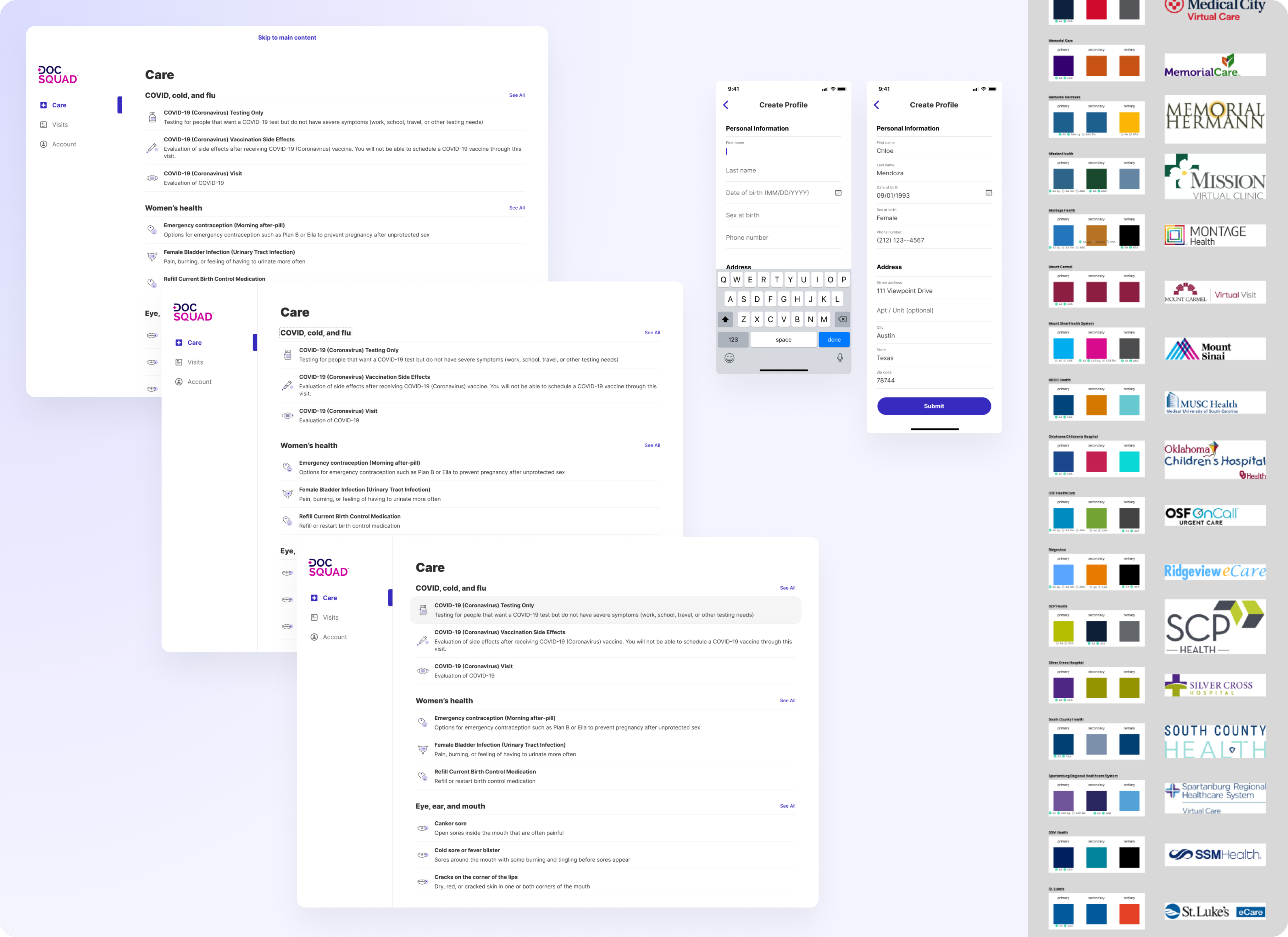
To avoid complexity, we modified our existing experience to let us use the same design for both DocSquad and all our 49 white-label clients. We followed the same patterns as our existing mobile code and optimized this to work for both narrow and wide layouts. We rethought our app in a way that would be scalable, using the logos, primary, and secondary colors that we already had from our enterprise clients. We found some areas of concern that would be especially damaging to the scalability of enterprise clients during the white-labeling process and developed standardizations to address these areas:
- Any place with two brand colors layered on top of each other: This meant that we needed to rethink our main Care tab and our Insurance tab to avoid layering brand colors on top of each other, and instead use brand colors only on white or light gray backgrounds to be scalable to all clients.
- Use of the tertiary color in places that would require it to meet contrast accessibility standards: While our mobile app used our brand's tertiary colors in the titles, many brands had tertiary colors that did not meet contrast requirements. Since we wanted to limit asking clients to change their brand theming as much as possible, we switched to dark gray titles and addressed any other areas where the tertiary color was used.
- Logo placement: Logos would need to be placed only on a white background since some brand logos are JPEGs that include a white background.
- Standardization of utility colors: We needed to rethink how we use colors to indicate success, error, and visit status, and we landed on a green and red that could be used universally. Further, although we were using a utility green to indicate completed visits, we need to change that so that it would not conflict with in-progress visits (indicated by the primary color) if the client's primary color was also green. Accordingly, we decided to limit our use of primary colors to indicate active states.
After auditing all of our existing clients, this only caused us to need to reach out to six clients for a new primary color.
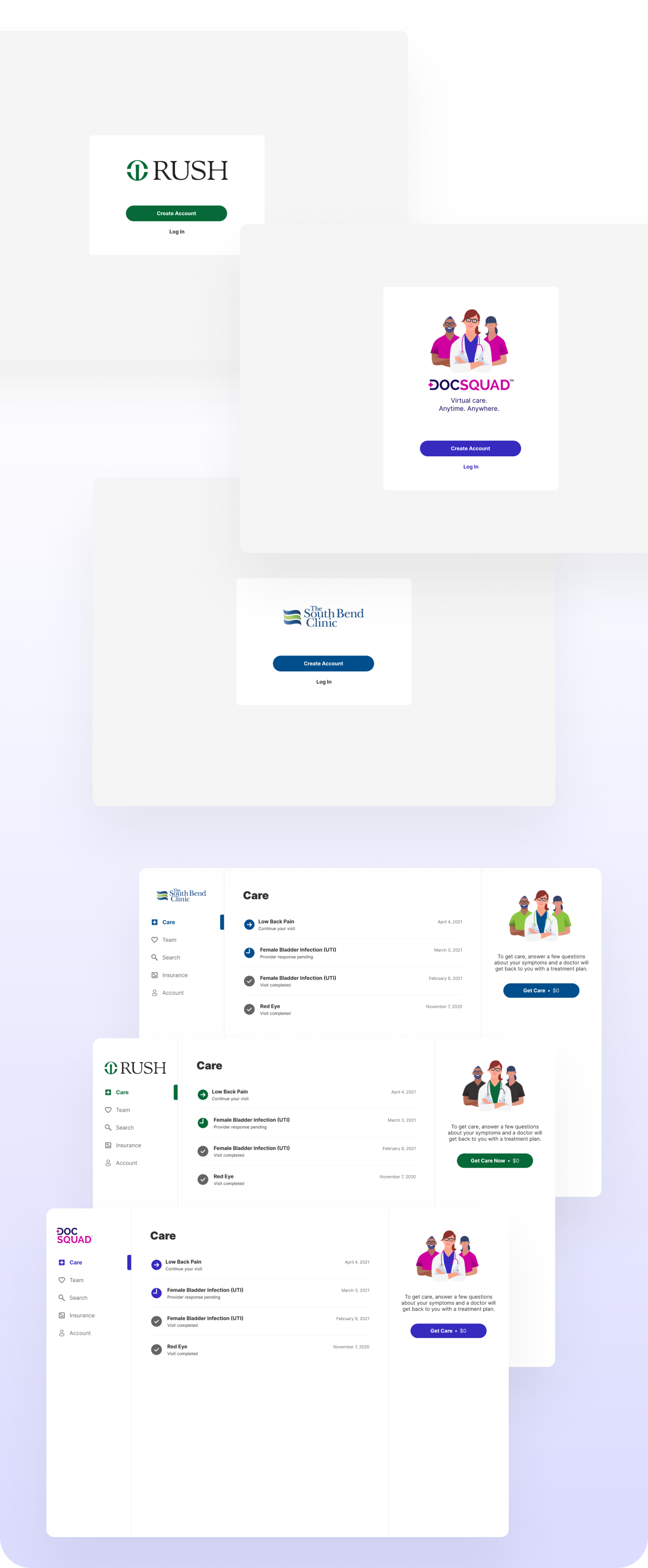
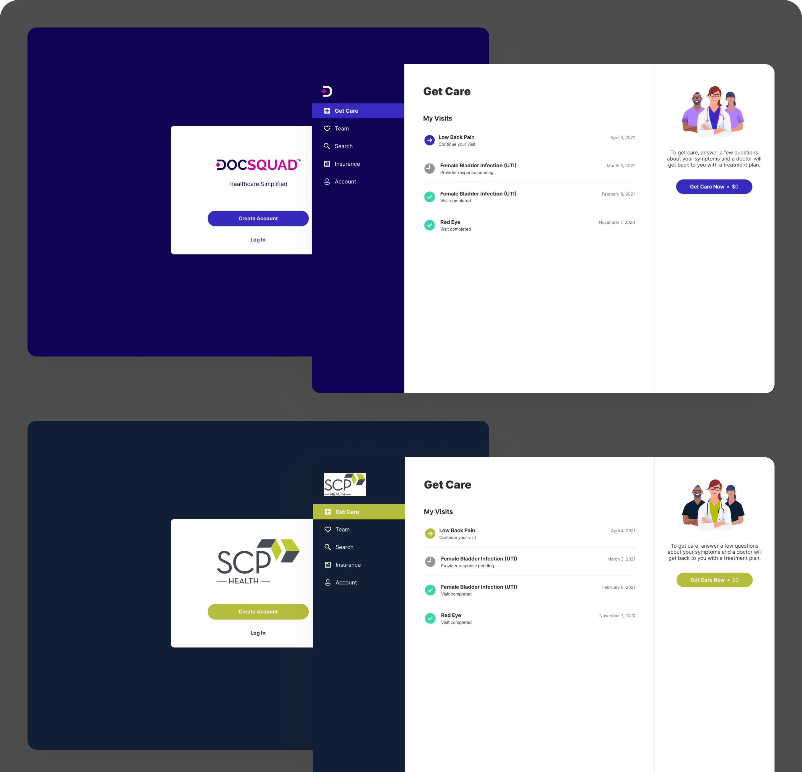
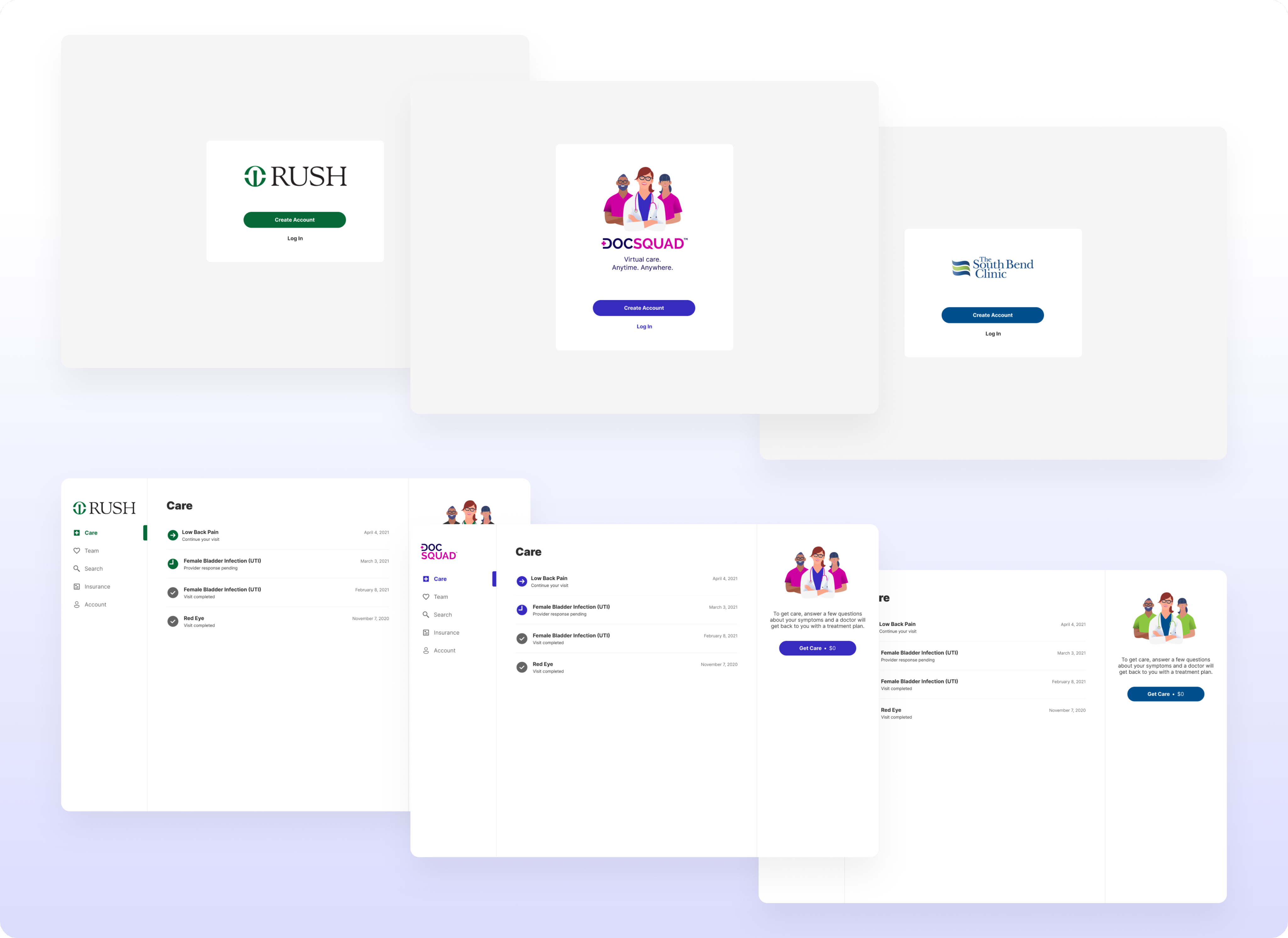
Web white label designs of the splash screen and main care tab
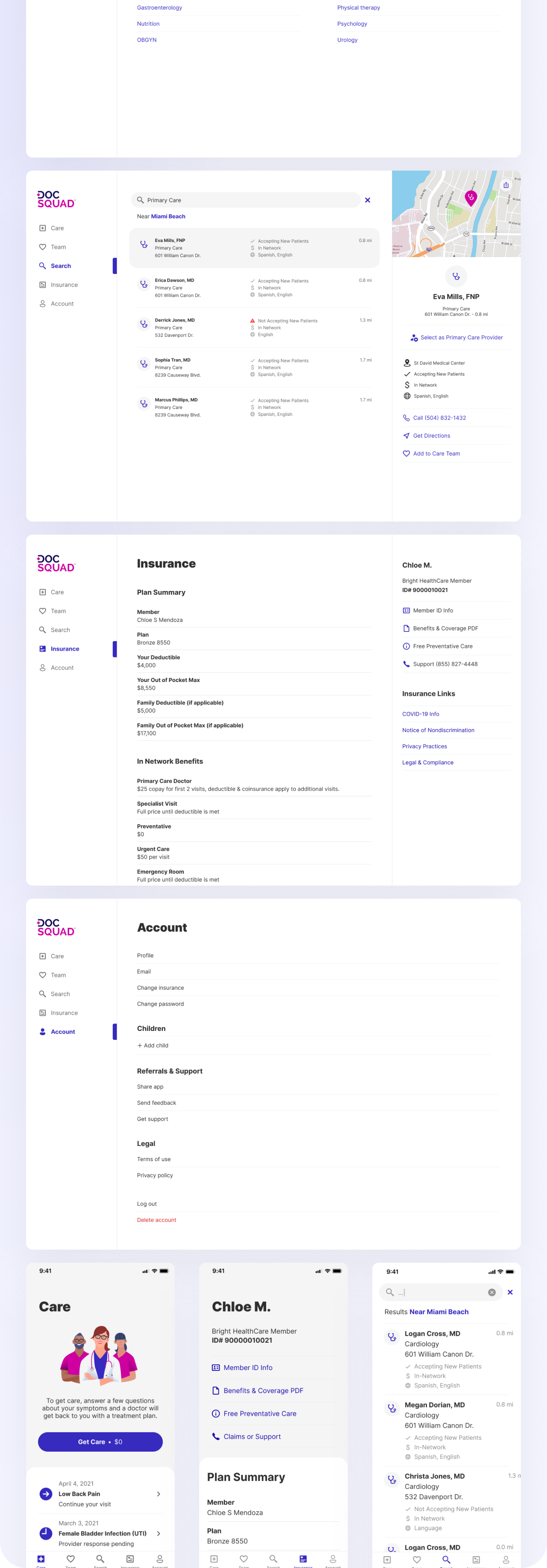
Web application and white label updates throughout the application
Post Research
We were able to address major errors from usability testing in our continued work. We added a way to edit personal information, as this feature was simply still in development during testing, and addressed some of the feedback around copy.Luckily, we had the opportunity to improve a number of the minor errors that were uncovered during usability testing as our work on this epic continued. While the website later got an overhaul in our DocSquad Redesign work, we were able to work on accessibility features such as keyboard navigation and text input labels.
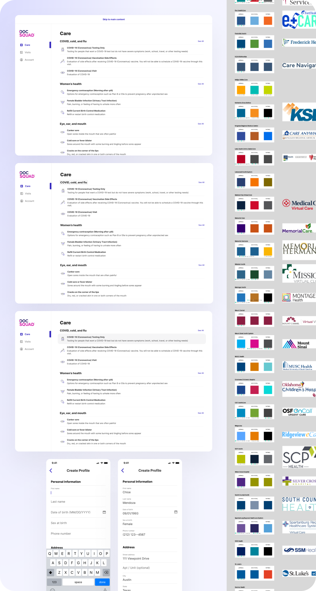
Accessibility addressed in future work
Lessons Learned
Just because something is designed well for mobile, that doesn't mean that it will be simple to transfer it over to web. In an ideal world, it would be preferred to design both in tandem from the start. However, because that was not the case, it is important to account for the different interaction styles and layouts requiring more work than anticipated. It is key to be flexible, for changes on web may require parallel changes on mobile, and compromises will need to be made when working in an agile environment.